Outdoor Advocacy Project: Building a Digital Hub for Environmental Action
The Outdoor Advocacy Project connects outdoor enthusiasts with meaningful ways to support conservation and policy change—but their website wasn’t making it easy to get involved. Key content was buried, calls-to-action lacked clarity, and the experience didn’t reflect the energy of the movement.
I led the UX strategy to restructure content, simplify navigation, and design approachable, action-oriented tools that made it easier for users to learn, engage, and take meaningful steps.
The result was a more accessible and mission-aligned platform—built to turn passion into stewardship.

The Challenge: Limited Engagement & Low Action
The Outdoor Advocacy Project needed a clear, action-oriented UX strategy to transform a static content site into a dynamic advocacy platform that inspired real-world participation. However, several usability barriers were limiting user engagement:
Confusing Content Hierarchy – Visitors struggled to navigate resources or understand where to start.
Buried Calls to Action – Key actions like signing petitions or joining events weren’t prominent or intuitive.
Inconsistent Visual Language – Design inconsistencies reduced trust and made the site feel less credible.
We needed a research-led UX strategy that clarified user pathways, surfaced meaningful actions, and built a sense of momentum—turning interest into real-world conservation engagement.
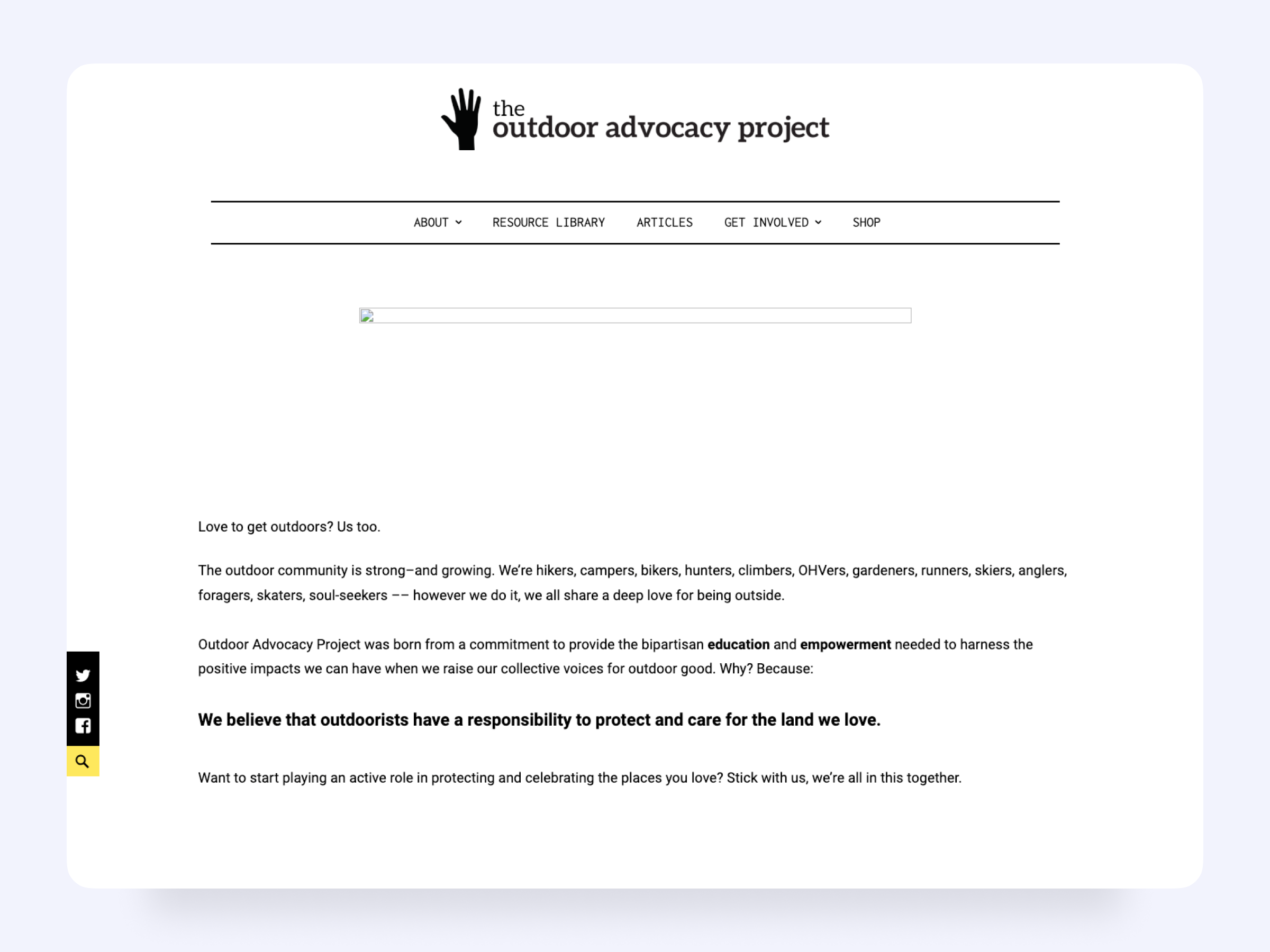
This is the most complete screenshot of the original homepage that I could find.
My Role in This Project
I led UX strategy, research, and content design for this digital advocacy platform—translating scattered information and minimal direction into a cohesive user experience that inspired real-world conservation action.
Working closely with the founder, I defined the site’s structure, clarified calls to action, and rewrote every piece of content for accessibility, clarity, and momentum. I also designed high-fidelity prototypes and led implementation direction for the development handoff.
This was a solo design engagement—every decision shown here reflects my research, strategy, and creative direction.
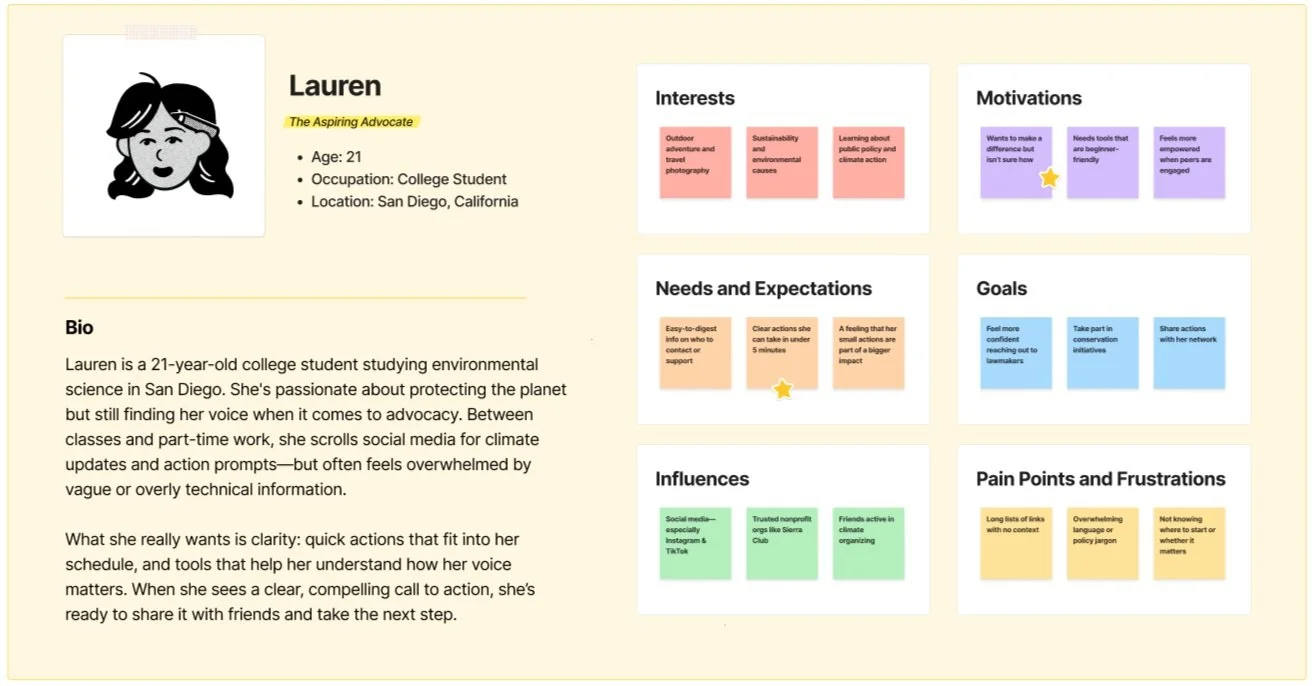
Designing for — Everyday Advocates in the Wild
The Outdoor Advocacy Project aimed to mobilize a broad spectrum of outdoor enthusiasts—from passionate conservationists to casual hikers—into taking real-world conservation action. Our design had to serve both seasoned organizers and newcomers just discovering the cause.
Key user groups included:
Outdoor Enthusiasts Seeking Impact: These users cared deeply about public lands and environmental protection, but often didn’t know where to start. They needed clear entry points, minimal friction, and messaging that aligned with their values.
Grassroots Organizers & Partner Groups: Often directing volunteers to the site, these users needed confidence that the platform would support ongoing engagement, not just a one-time click. Ease of use and trust in the brand experience were critical.
We worked from a flexible user persona, Lauren, to keep the design grounded in real motivations—from staying informed on local legislation to making a difference through everyday actions.
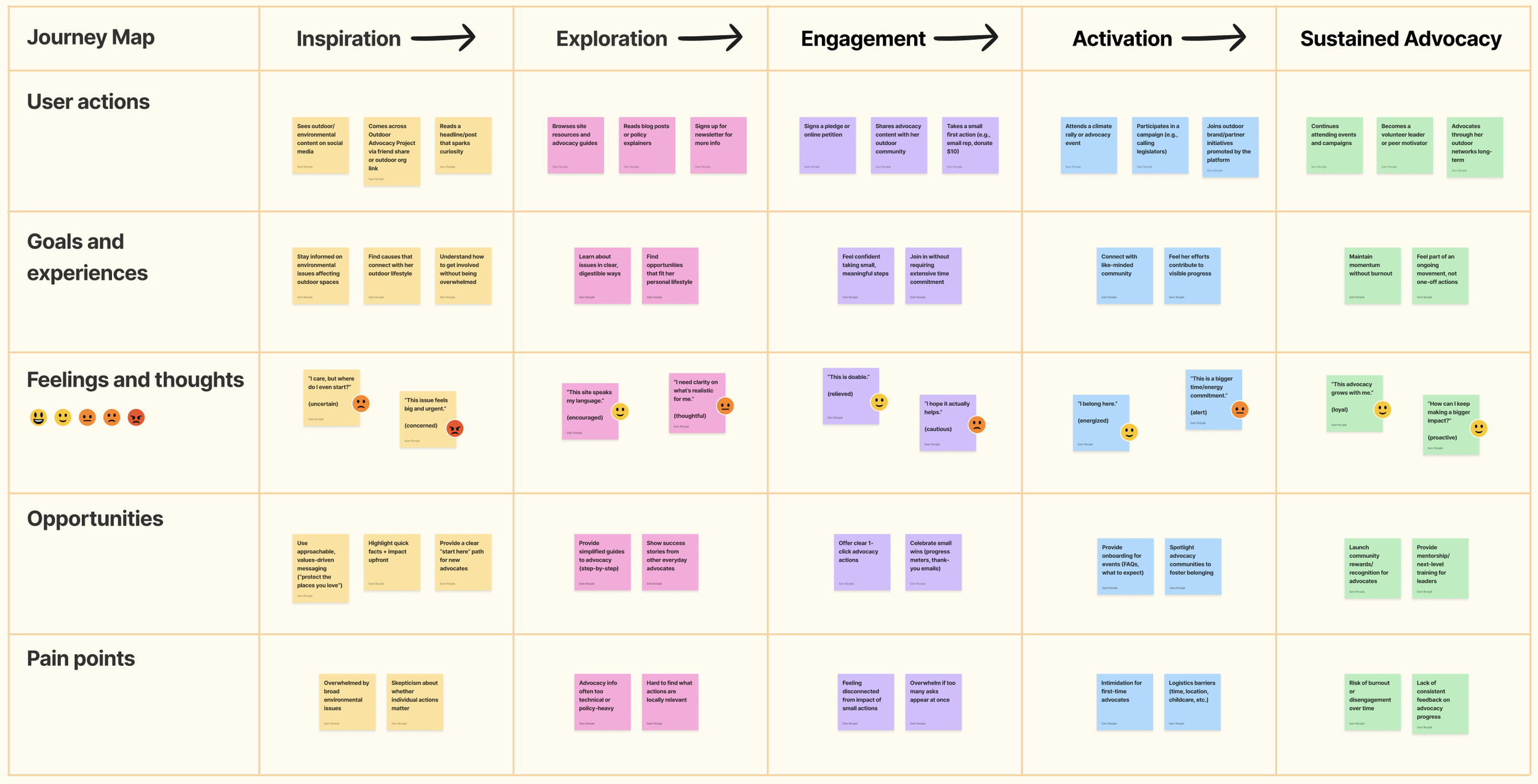
The Solution: A UX Strategy to Drive Engagement and Action
To transform the Outdoor Advocacy Project into a more engaging, accessible, and action-driven platform, I focused on improving navigation, content clarity, and user engagement.
Content & IA Restructuring – Organized advocacy tools and educational resources into an intuitive, easy-to-navigate framework.
Clearer Calls to Action – Refined messaging and interface elements to guide users toward conservation efforts and community involvement.
Simplified Content Presentation – Improved readability and accessibility to make key information more digestible and actionable.
Mobile & Performance Enhancements – Optimized for mobile usability and site performance to support users engaging with the platform on the go.
With these improvements, the Outdoor Advocacy Project became a clear, structured, and action-oriented platform that empowers users to meaningfully support environmental conservation.
The Process & What I Did
Audit the Existing Site
Goal: Identify gaps in usability, clarity, and engagement that limited advocacy impact.
I started by reviewing the existing Outdoor Advocacy Project site, focusing on how information was structured and how calls to action appeared (or often didn’t). Content was scattered across long pages, advocacy resources were hard to find, and CTAs blended into the background. This initial audit revealed friction that discouraged users from staying engaged or taking meaningful next steps.
Clarify Advocacy Pathways
Goal: Define the key actions users should take and align site structure around them.
Working with the project team, I mapped the primary advocacy actions—such as joining a campaign, accessing educational resources, and signing up for events. We restructured the site navigation to surface these actions immediately, reducing the steps needed to get involved. This ensured that the most impactful behaviors were always visible and supported by context.
Simplify Content Presentation
Goal: Make information digestible and actionable across different user groups.
Advocacy resources were often buried in dense blocks of text, which discouraged quick understanding. I broke this content into modular sections, supported by headings, scannable bullets, and clear visuals. Each page was designed to answer “what this is, why it matters, and what you can do about it,” helping users move from awareness to action without overwhelm.
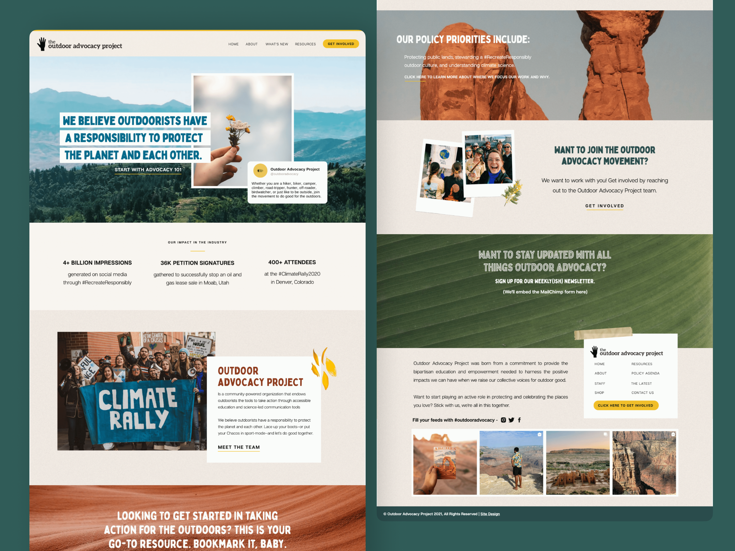
Design a Trustworthy Visual Language
Goal: Reinforce credibility with a visual style that balanced professionalism and passion.
The previous site leaned heavily on plain templates that didn’t reflect the urgency or legitimacy of the mission. I created a clean, nature-inspired design system with strong contrast for accessibility and clear hierarchy to guide attention. This visual layer helped the organization feel both approachable and credible, inspiring confidence from first impression.
Validate with Users & Advocates
Goal: Ensure the redesigned experience was intuitive, motivating, and accessible.
I conducted feedback sessions with a mix of volunteers, partner organizations, and community members. Their input confirmed that clearer navigation and action-oriented CTAs significantly improved their likelihood of engaging. Adjustments were made to copy, button placement, and accessibility considerations, ensuring the site supported the widest possible audience.
Set Up for Long-Term Advocacy Growth
Goal: Build a flexible platform that could evolve alongside new campaigns and content needs.
Finally, I created modular content patterns and a style guide so that the internal team could launch future campaigns without redesign support. With clear rules for layout, calls to action, and resource organization, the site became a durable platform—able to expand as advocacy needs changed while maintaining a consistent and action-driven experience.
The Outcome: A More Accessible, Action-Driven Advocacy Platform
The redesigned platform removed friction from critical user journeys—empowering more people to engage with conservation efforts from wherever they were.
✅ Easier Access to Advocacy Resources — Simplified site architecture made educational materials, policy updates, and toolkits easy to find and share.
✅ Increased Participation in Conservation Campaigns — Clearer calls to action and guided flows led to higher rates of petition signatures, volunteer sign-ups, and email outreach.
✅ Strengthened Community Connections — Enhanced pathways made it easier for supporters to join local chapters, attend events, and stay engaged.
✅ Mobile-First Experience for On-the-Go Activism — Responsive design ensured seamless access to tools and actions across all devices—meeting users where they are.
“My team and I are sitting down later today to comb through the full site and provide a final round of feedback but first I just have to gush about how beautiful this site looks. I keep toggling back and forth between the old site and the new one and my jaw is on the floor at this absolute GLOW UP.”
Scope & Constraints
Scope:
This project was part of a lean design initiative for a mission-driven nonprofit, focused on improving content clarity, page structure, and strategic calls-to-action—without redesigning from scratch.
As the sole designer, my role centered on UX strategy and information architecture, shaping a modular system that could support evolving campaigns while building trust with new audiences.
Constraints:
No Engineering Team: We had no dedicated engineers, only limited dev support during implementation—requiring solutions that worked within the platform’s existing constraints.
Legacy Platform Limitations: The nonprofit’s CMS had structural quirks and few customization options, so we had to be clever with how we introduced clarity without overhauling the system.
Tight Budget & Timeline: With minimal funding and fast-moving advocacy goals, every design choice had to be high-impact and low-debt.
Lean, Asynchronous Workflow: Content strategy, implementation, and testing happened in parallel, so design decisions had to be clearly documented, intuitive, and easy for collaborators to run with.
Lessons Learned
This project emphasized the importance of user-friendly content presentation in nonprofit and advocacy spaces.
My key takeaways include:
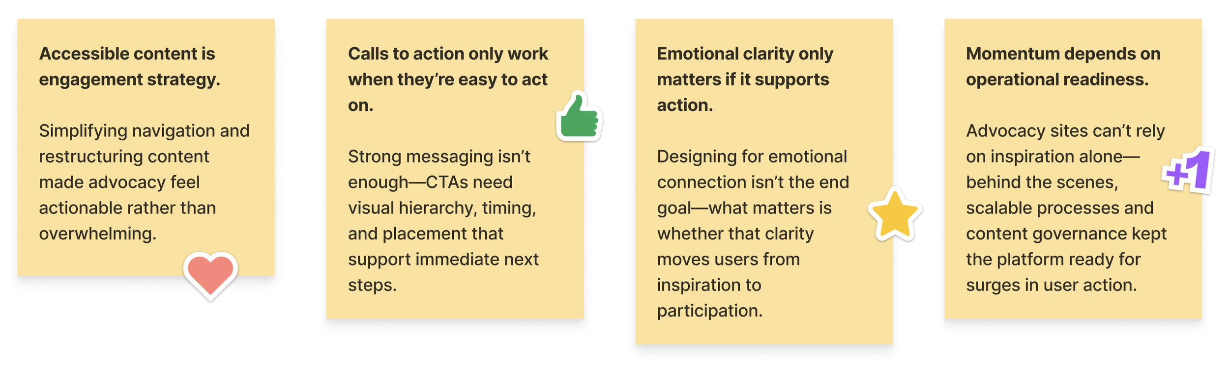
Moving forward, I aim to design advocacy platforms with adaptive engagement frameworks—built to evolve alongside shifting community needs while preserving clarity, momentum, and mission impact.
The Real Win
Making conservation feel personal—with digital tools that moved users to act.
Referenced Frameworks & Reading
A few resources that influenced my approach on this project:


