Everhive: Driving Workforce Platform Impact with UX Strategy
Everhive is a workforce management startup focused on HR, staffing, and employee development for enterprise clients. But without a clear digital presence, the brand struggled to communicate its value and build credibility in a competitive B2B market.
I led the UX strategy for Everhive’s first marketing site—structuring content, clarifying the brand narrative, and designing a scalable system that balanced clarity with professional polish.
The result was a conversion-ready platform that helped Everhive establish trust, differentiate their offering, and support an expanding sales pipeline.

The Challenge: Everhive’s Website Wasn’t Converting
Everhive needed a clear, conversion-focused UX strategy to build trust with enterprise clients and stand out in a saturated workforce management market. But several core issues were limiting engagement:
Unclear Value Proposition – Visitors didn’t understand Everhive’s offering or how it differed from competitors.
Low Conversion Rates – The site lacked strong CTAs and UX patterns that guide decision-makers toward contact or consultation.
Fragmented Content Structure – Poor hierarchy and layout made it hard for users to explore services or share the site internally.
To drive meaningful action, we needed a research-led UX overhaul that clarified Everhive’s value, streamlined site architecture, and enabled conversion-oriented content strategy.
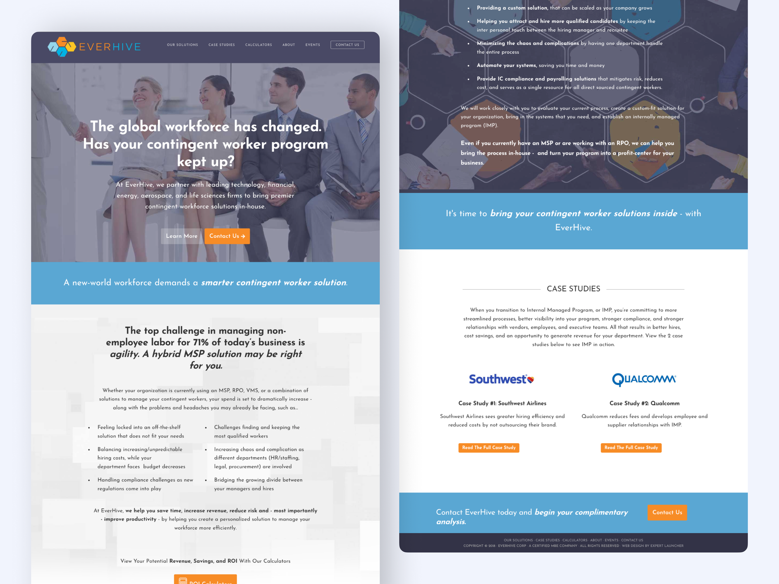
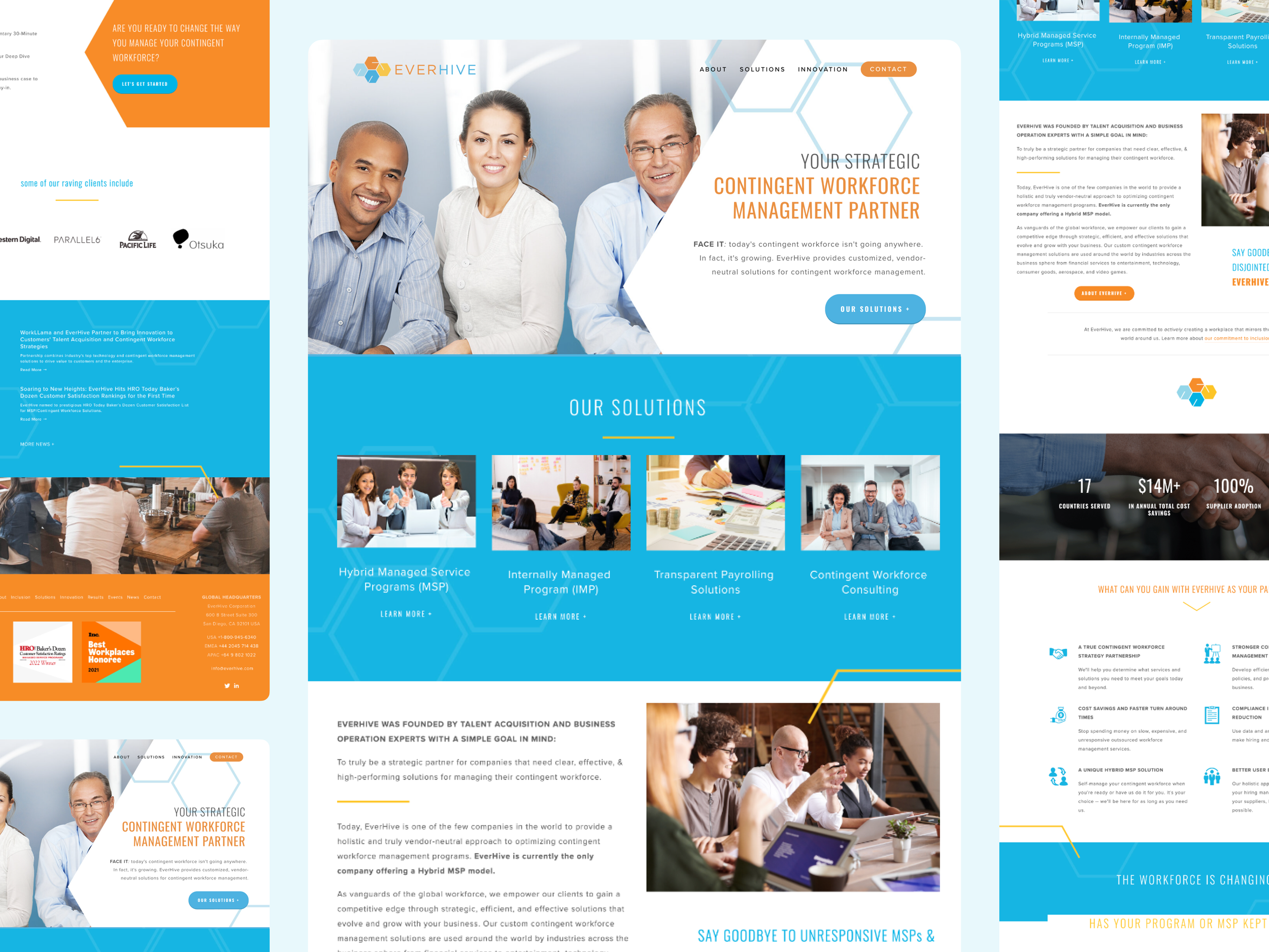
Original landing page: professional but unclear, with weak CTAs and fragmented structure that limited conversions.
My Role in This Project
I led UX strategy, research, and information architecture for this end-to-end website transformation—mapping user journeys, defining the site’s structure, and shaping scalable patterns aligned with Everhive’s business goals.
Working closely with Everhive’s leadership and content partners, I led a fast-paced, fully remote project from initial discovery through handoff. My responsibilities included synthesizing stakeholder input, developing the sitemap and content hierarchy, and collaborating on a clear, conversion-optimized experience that reinforced Everhive’s credibility in a crowded B2B market.
While this case study highlights my strategic leadership, it was a highly collaborative effort—with content, visual design, and SEO handled by other team members listed further below.
Designing for — Skeptical Buyers in a Saturated Market
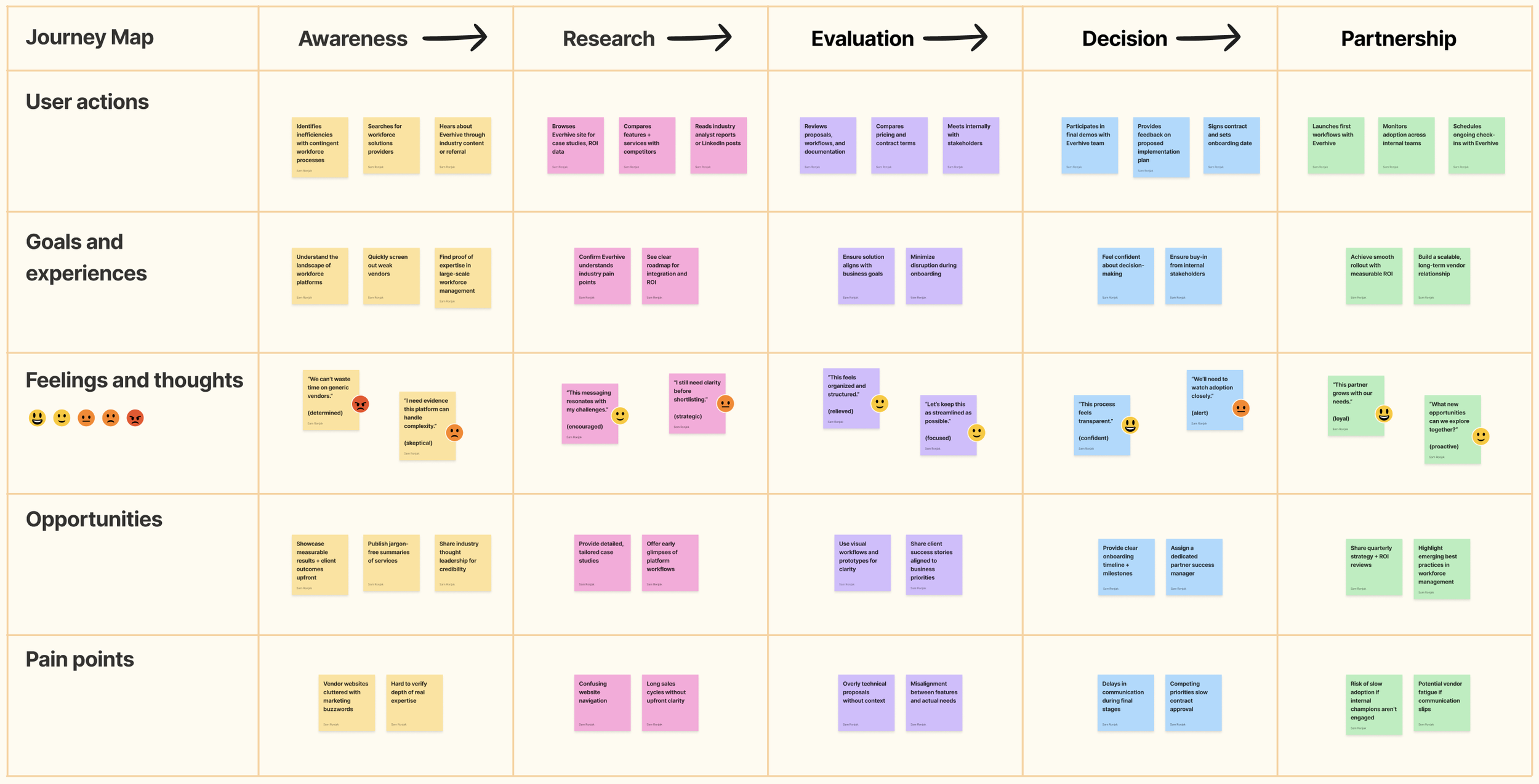
Everhive’s website wasn’t just a marketing asset—it was a first impression for enterprise leaders weighing high-stakes workforce management decisions. The site needed to earn trust quickly, clarify offerings without jargon, and convert interest into action.
We focused on two primary user groups:
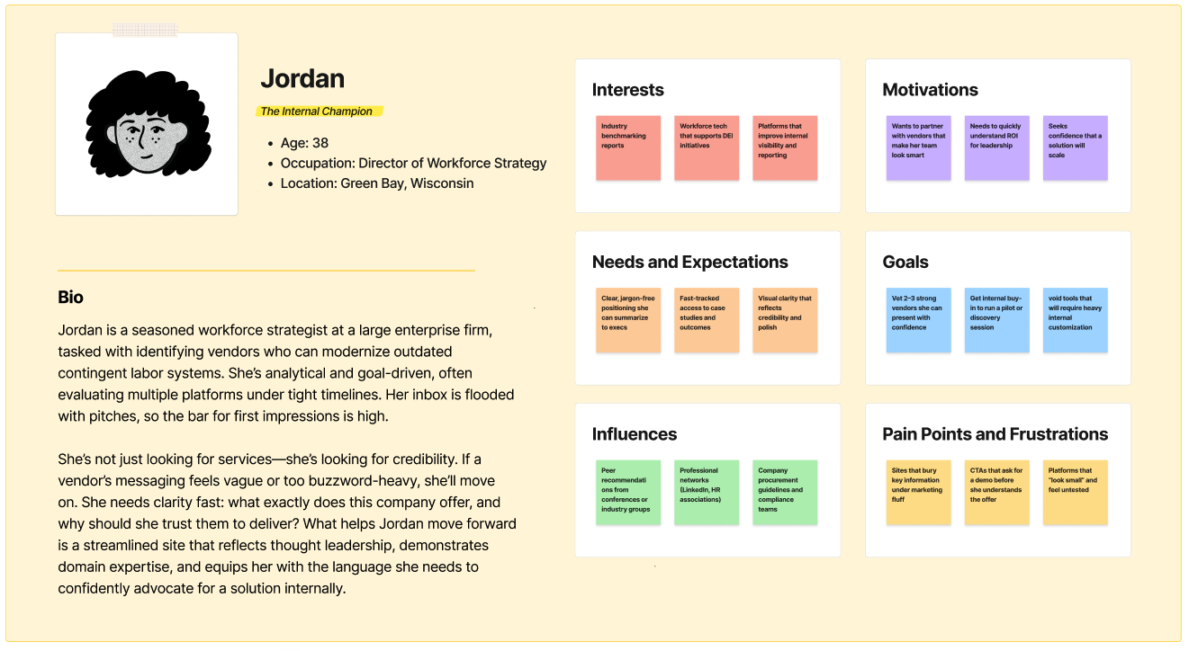
Procurement & HR Executives: Often evaluating multiple vendors, these users prioritized credibility, clarity, and the ability to present Everhive as a viable option internally. Any friction—like unclear CTAs or vague positioning—risked losing the lead entirely.
Mid-Level Operations Managers: Frequently tasked with gathering vendor options or exploring pilot partnerships, this group needed digestible overviews, confidence in Everhive’s legitimacy, and clear next steps to move the conversation forward.
These audiences weren’t just scanning for features—they were vetting for trust, expertise, and fit. Our UX strategy needed to help Everhive show up like the strategic partner it already was.
The Solution: A Research-Led UX Strategy to Drive Engagement
To position Everhive as a credible industry leader, I implemented a research-driven UX strategy focused on content clarity, streamlined navigation, and stronger conversion pathways.
User Research & Competitive Analysis – Conducted interviews with potential clients and benchmarked competitors to refine positioning and uncover user pain points.
Information Architecture Overhaul – Restructured navigation to improve discoverability, simplify pathways, and guide decision-makers more effectively.
Wireframing & UX Testing – Developed low-fidelity prototypes, validated flows with users, and iterated based on feedback to ensure clarity and usability.
The redesigned experience now serves as a scalable foundation, reinforcing Everhive’s credibility and supporting long-term engagement with enterprise clients.
The Process & What I Did
Clarify Market Positioning
Goal: Understand how Everhive’s message compared to competitors and identify credibility gaps.
I started with a competitive audit and stakeholder interviews to understand how Everhive was presenting itself versus how enterprise clients perceived workforce management partners. This revealed a disconnect: while Everhive offered a hybrid model with clear advantages, their site didn’t articulate those differentiators in a way that resonated with decision-makers.
Restructure the Information Architecture
Goal: Make Everhive’s services discoverable and easy to share with decision-makers.
The existing site buried critical information in dense subpages. I reorganized the navigation and page hierarchy to highlight value propositions, case studies, and consultation pathways. This allowed visitors to immediately see what set Everhive apart, while giving internal champions a structure they could easily forward to executives.
Refine the Value Proposition
Goal: Translate Everhive’s complex offering into simple, benefits-driven messaging.
Through workshops and copy iterations, I helped the team shift from feature-heavy explanations to concise, outcome-oriented language. Instead of emphasizing internal jargon, we framed the story around client benefits: efficiency, cost savings, and long-term scalability. This clarity positioned Everhive as a trusted partner rather than just another vendor.
Prototype and Test Conversion Flows
Goal: Ensure site visitors could easily move from curiosity to consultation.
I created wireframes and prototypes focused on conversion flows—calls to action, consultation forms, and inquiry prompts. These were tested with a mix of stakeholders and prospective users, validating that clearer pathways increased the likelihood of booking consultations. Small shifts in button placement and form length made a significant impact on usability.
Design for Trust and Professionalism
Goal: Elevate the visual identity to match enterprise client expectations.
The final design paired a clean, contemporary interface with professional imagery and subtle use of Everhive’s brand palette. Every layout emphasized readability and credibility, ensuring the site projected confidence to large-scale clients evaluating multimillion-dollar partnerships.
The Outcome: A Scalable, Conversion-Optimized B2B Platform
The redesigned website helped Everhive grow its B2B presence with a UX strategy built for clarity, credibility, and future expansion.
✅ Increased Lead Generation Through Clear Positioning — A more focused site narrative attracted qualified leads and reinforced Everhive’s reputation as a trusted workforce solutions partner.
✅ Streamlined Navigation and Content Architecture — Simplified structure and content flow made it easier for enterprise clients to explore offerings and understand Everhive’s value.
✅ Stronger Brand Differentiation in a Crowded Market — Research-backed messaging and design helped Everhive stand apart from competitors—building authority and trust.
✅ Scalable UX for Long-Term Growth — A modular design system and flexible content model laid the groundwork for evolving services and future digital needs.
“The HeiPro team was able to extract a complicated abstract from my head into an amazing website that continues to get rave reviews. Nothing was off the table in terms of ideas and design. What’s even more incredible is that the team thinks of all aspects to make it easier — from copywriting and SEO to ensuring they are capturing our personality in their design.”
Project Team
This project was a collaborative effort across UX, design, content strategy, and SEO, ensuring a seamless and impactful digital transformation.


Scope & Constraints
Scope:
This project aimed to take Everhive from an early-stage brand concept to a fully launched B2B marketing site in just six weeks. Our scope included defining the site’s structure, crafting the narrative flow, and shaping the core user experience to support a growing sales team that lacked a digital presence.
We focused on architecture, wireframing, and UX alignment, while visual design and final content production were owned by partner teams.
Constraints:
Condensed Timeline: With just six weeks from kickoff to launch, we had to move quickly while still anchoring our choices in research and stakeholder alignment.
Divided Ownership: UI design, brand identity, and content were led by separate collaborators, requiring extra clarity and proactive communication to keep the UX cohesive.
Remote-Only Collaboration: The team spanned multiple time zones and disciplines, so we relied heavily on async documentation, rapid iteration, and tight feedback loops to stay on track.
High-Stakes Visibility: As Everhive’s first public touchpoint, the site needed to establish credibility immediately—balancing story, structure, and trust in a crowded B2B landscape.
Lessons Learned
Through this project, I gained key insights into designing for B2B audiences in a competitive industry.
Some of my biggest takeaways include:

In future projects, I’ll prioritize early usability testing as a strategic tool—stress-testing assumptions sooner to reduce friction, strengthen content clarity, and unlock faster alignment across stakeholder groups.
The Real Win
Turning complexity into clarity — so stakeholders finally saw themselves in the solution.
Referenced Frameworks & Reading
A few resources that influenced my approach on this project: