Jones Sign: UX Overhaul for a National B2B Signage Leader
Jones Sign is a national leader in large-scale architectural signage—but their 40+ page marketing site wasn’t keeping pace. The content was outdated, hard to navigate, and no longer reflected the scale or credibility of the business.
I led the UX strategy to modernize the site—conducting stakeholder research, refining the information architecture, and restructuring key content to support clarity, trust, and lead generation.
The result was a conversion-focused experience that elevated the brand and gave internal teams a scalable foundation for future growth.
The Challenge: A Dated Website That Undermined Industry Leadership
Jones Sign’s website failed to reflect the company’s stature as a national leader in architectural signage. Instead of reinforcing industry authority, the site’s outdated structure and messaging created confusion and limited lead generation.
Key issues included:
Outdated Visual Design – The site didn’t communicate Jones Sign’s expertise, capabilities, or national footprint.
Disorganized Information Architecture – Visitors struggled to navigate services, explore case studies, or understand what set Jones apart.
Unclear Conversion Pathways – Calls-to-action were inconsistent or buried, reducing the likelihood of inquiries or follow-ups.
We needed a content-led UX strategy that positioned Jones Sign as a trusted partner, streamlined exploration, and turned credibility into conversions.
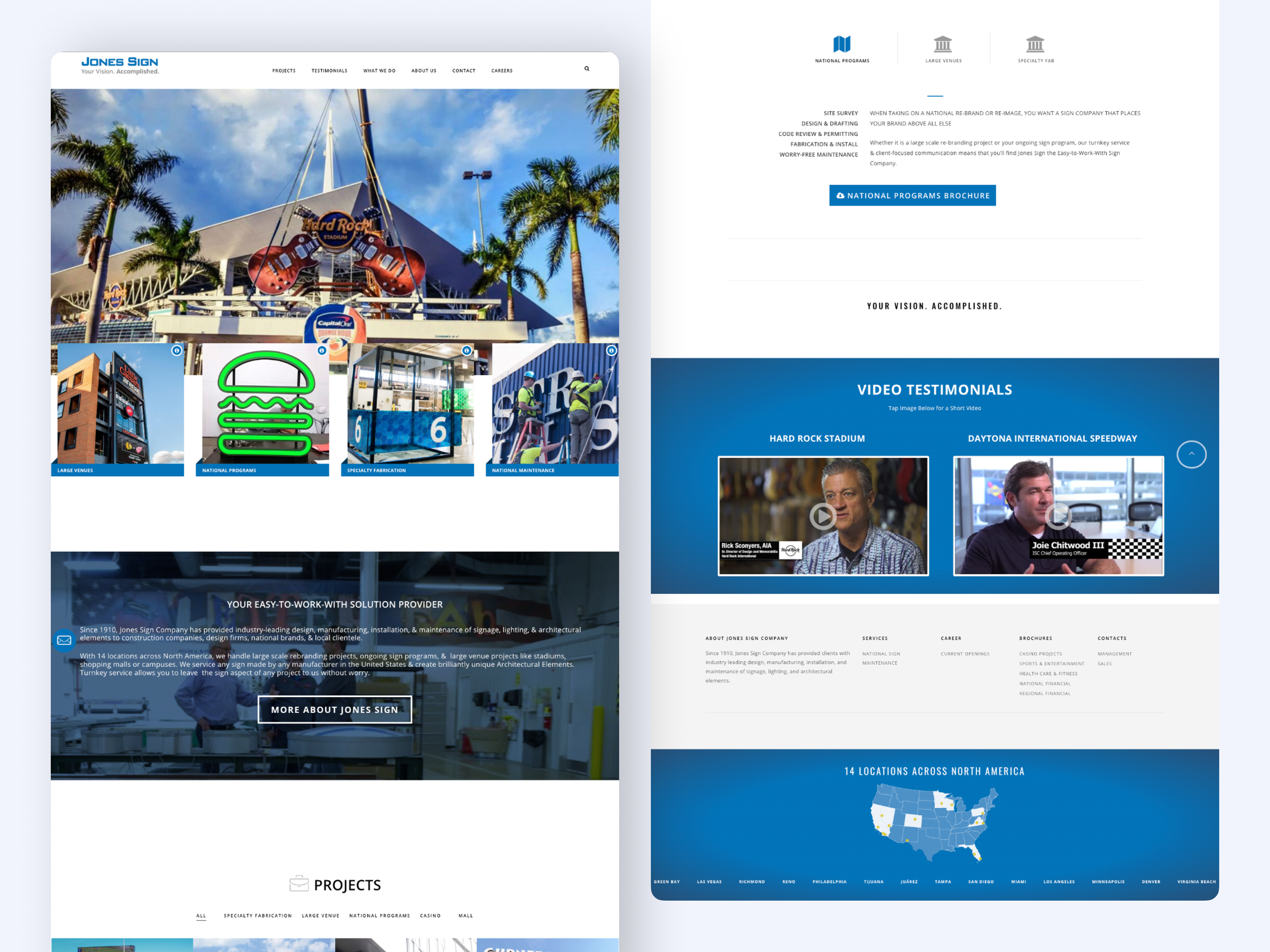
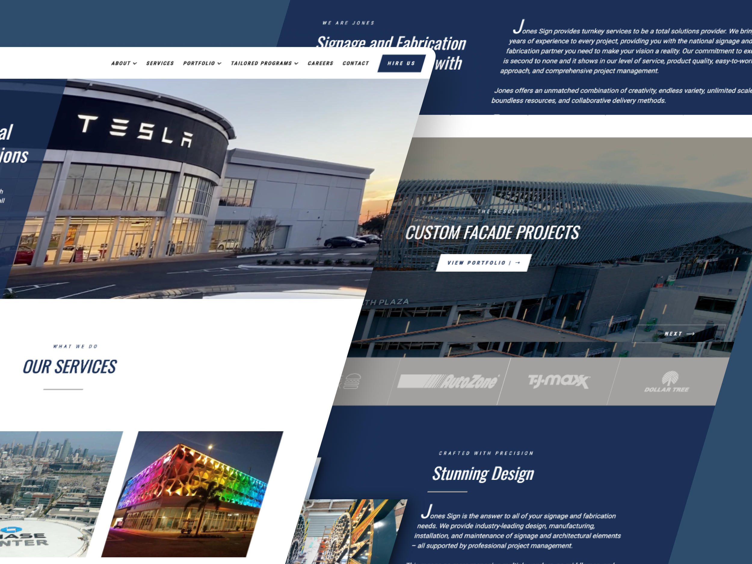
Original Jones Sign site: dated design and disorganized structure that undermined credibility and limited lead generation.
My Role in This Project
I led UX strategy, research, and information architecture for this website overhaul—restructuring site content, defining navigation patterns, and creating a scalable framework aligned with Jones Sign’s business goals.
This project was fast-paced and fully remote, with close coordination between our agency leads and the clients. I worked collaboratively with the broader project team to support the research and content strategy from discovery through handoff. My responsibilities included auditing the existing site, synthesizing stakeholder input, and developing a streamlined sitemap to better showcase Jones Sign’s national portfolio and core services.
While this case study highlights my strategic contributions, it was part of a broader collaborative effort—visual design, content, and development were handled by other team members listed below.
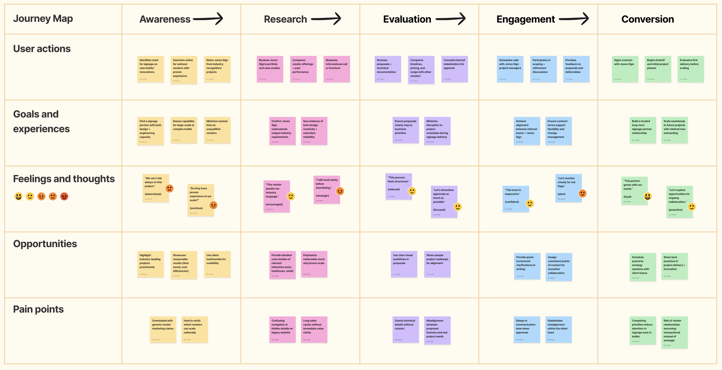
Designing for — Decision-Makers Under Pressure
Jones Sign’s website redesign wasn’t about driving casual traffic—it was about reinforcing reputation, supporting complex B2B sales, and making the company’s breadth of services easy to understand for prospective enterprise clients. The site had to appeal to multiple audiences across a long sales cycle, while clearly reflecting Jones’ national reach and high-profile partnerships.
Key user groups included:
B2B Procurement Leads: Often tasked with sourcing signage vendors for commercial real estate, healthcare, or transportation projects. These users cared about industry credibility, client logos, and timelines—and wanted to verify that Jones could handle complexity at scale.
Project Managers & Development Consultants: These users were actively scoping signage needs for high-value properties. They needed quick access to services, timelines, and visual proof that Jones had done this type of work before. Photography and project depth were especially influential.
Internal Marketing & Sales Teams: Jones’ in-house teams needed a site they could use in proposals, RFPs, and sales conversations. The site had to feel modern, load quickly, and reinforce trust at a glance.
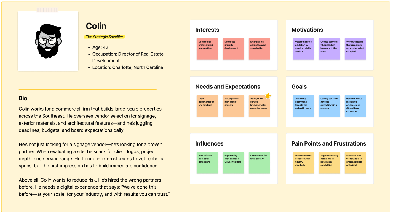
Given the internal alignment and stakeholder collaboration involved, it would be valuable to build a flexible persona—like Colin, a Commercial Real Estate Project Lead—to represent core B2B buyers. His persona could help anchor future decisions across service pages, visuals, and lead-generation strategy.
The Solution: A Content-Driven UX Overhaul for Better Lead Generation
To modernize Jones Sign’s digital presence, I developed a UX strategy focused on information clarity, user engagement, and conversion optimization.
Restructured Site Navigation – Simplified the content hierarchy to make it easier for potential clients to find relevant services and case studies.
Portfolio Optimization – Transformed the project gallery into an interactive showcase that highlighted Jones Sign’s expertise and industry reach.
Lead Generation Enhancements – Implemented strategically placed calls-to-action and inquiry forms to increase conversion opportunities.
UX & UI Refinements – Elevated the site’s visual design to better reflect Jones Sign’s brand authority and credibility.
These improvements positioned Jones Sign as a trusted industry leader, making it easier for potential clients to explore their capabilities and connect with their team.
The Process & What I Did
Audit the Existing Website
Goal: Identify where outdated design and poor structure undermined credibility and usability.
The original Jones Sign website failed to reflect their industry leadership. Visual design was dated, navigation was inconsistent, and the project portfolio was buried in a way that limited discoverability. I performed a full audit of the content, architecture, and user flows, mapping out the specific friction points that weakened authority and suppressed lead generation.
Define Content Priorities
Goal: Clarify what mattered most to prospective clients and position Jones as a trusted partner.
I worked with the team to analyze Jones’s existing content and marketing materials alongside competitor benchmarks to identify the strongest differentiators: national reach, specialized capabilities, and turnkey delivery. These value drivers became the anchors for restructuring the site’s narrative. By foregrounding these priorities, the content shifted from a generic service list to a clear articulation of Jones’s authority and proven expertise.
Restructure Information Architecture
Goal: Create a logical, streamlined navigation that made services and expertise easy to explore.
I reorganized the site into a simplified structure that balanced breadth of services with clarity. Visitors could now quickly understand Jones’s national presence, dive into relevant service areas, and explore supporting case studies. By removing redundancies and tightening hierarchy, the site began to serve as both a marketing asset and a practical sales tool.
Reimagine the Portfolio Experience
Goal: Showcase Jones’s expertise through an interactive, client-friendly case study library.
The portfolio was one of Jones’s strongest credibility drivers, yet the old site obscured it behind cluttered layouts. I transformed it into a searchable, visually compelling gallery that highlighted marquee projects. Each case study was optimized to reinforce trust, combining high-quality visuals with concise storytelling about impact, scale, and outcomes.
Design for Conversion
Goal: Ensure every pathway guided prospects toward inquiry and engagement.
Calls-to-action were elevated from afterthoughts to consistent, well-placed prompts throughout the user journey. From project pages to service overviews, users were encouraged to reach out at natural decision points. Inquiry forms were streamlined to reduce friction, making it easier for prospects to connect with Jones directly.
Elevate Visual Design
Goal: Modernize the brand online while aligning with Jones’s established authority.
The new interface emphasized clarity and confidence, using a clean visual system that highlighted Jones’s scale and professionalism. Photography, typography, and layout choices balanced modern polish with the established gravitas expected of a national leader. The updated design positioned Jones as a forward-looking partner while respecting their legacy.
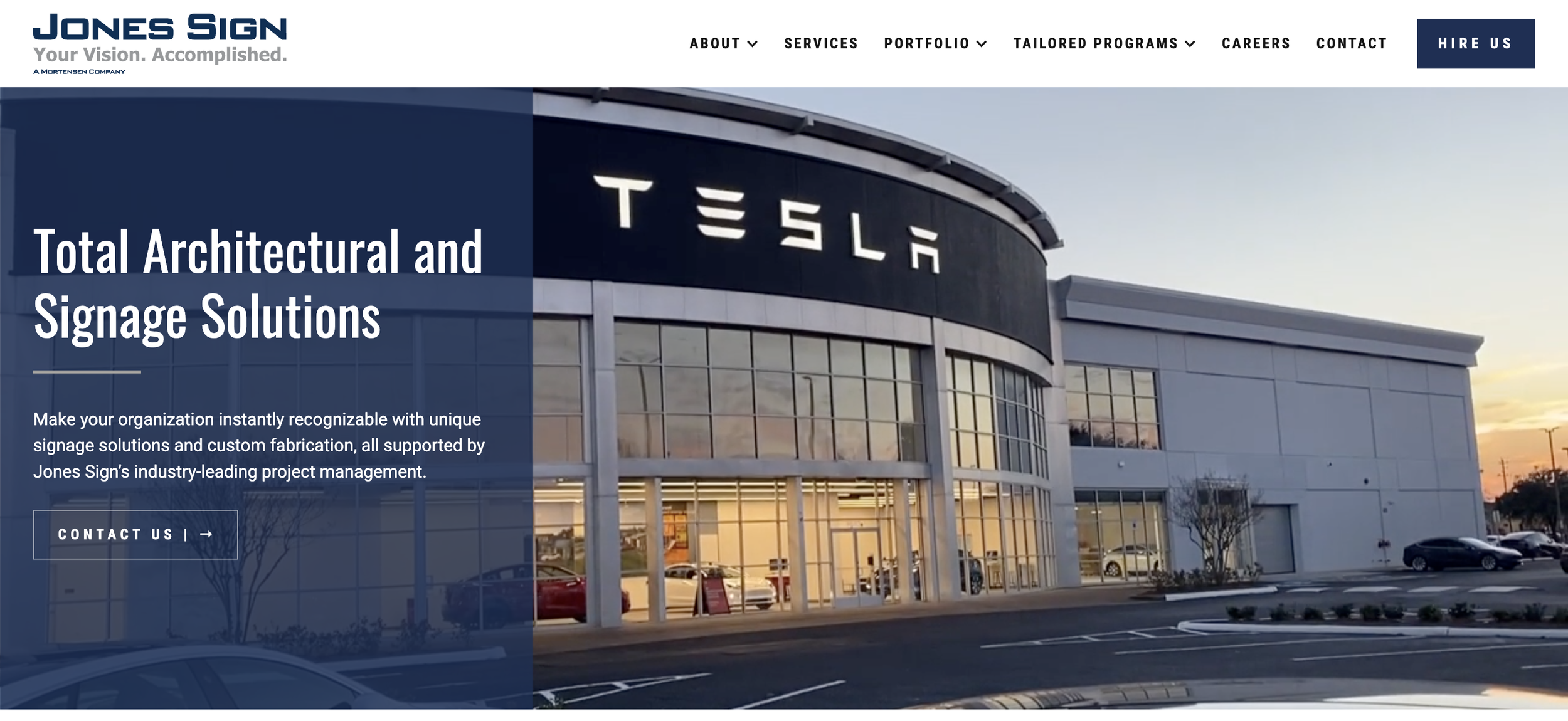
The Outcome: A Lead-Generating Website That Reflects Industry Experience
The redesign delivered more than a facelift—it sharpened the site’s ability to convert interest into qualified leads while spotlighting Jones Sign’s decades of expertise
✅ Streamlined Navigation for Services & Portfolio — Intuitive pathways helped users quickly find relevant capabilities and case studies across complex service lines.
✅ Boosted Engagement with Showcase Projects — A refreshed case study layout invited deeper exploration, highlighting the scale and quality of Jones Sign’s work.
✅ Elevated Brand Credibility — The modernized visual design reinforced Jones Sign’s position as a trusted industry leader in architectural signage and national rollouts.
✅ Optimized for Conversion — Strategically placed inquiry forms and CTAs made it easier for prospective clients to take the next step.
“The team at HeiPro Digital has been fantastic to work with. We were looking to upgrade our website to align with our company goals and growth, and that is when we found HeiPro Digital. They have been nothing but incredible to work with. They dove right in to learn our business and understand our company goals in order to truly promote who Jones Sign is through our website. Since our website launched, we have received nothing but compliments from employees and customers. We are elated with our new website!”
“The Jones Sign website was a massive project that involved nearly every member of our team. This was an exercise in cooperation and communication, both internally and with the Jones team. We are thrilled with the outcome, which is made even more rewarding because it demonstrates just how well our team can work together even on the most challenging of projects!”

Project Team
This project was a collaborative effort across UX, content strategy, and digital design, ensuring a structured and engaging online presence for a national signage leader. Here’s the team that brought it to life.


Scope & Constraints
Scope:
This project focused on delivering a content-first UX strategy for a national signage company’s website—serving as both a sales enablement tool and a trust-building asset for prospective clients.
While not client-facing, I collaborated closely with the internal design and content leads to define the site’s narrative structure, restructure its information architecture, and provide documentation to guide visual and content execution. The goal: create a UX foundation that aligned internal stakeholders while elevating external credibility.
Constraints:
Fragmented Legacy Content: The existing site made it difficult to tell a cohesive story—content was scattered, inconsistent, and misaligned with the company’s growth-stage needs.
Cross-Departmental Input: Leadership, sales, and creative teams all had input, requiring thoughtful synthesis and stakeholder alignment to maintain forward momentum.
Nonlinear Workflow: Design and content development ran in parallel, so IA work had to be rock-solid, clearly communicated, and flexible enough to adapt to evolving needs.
Trust-Heavy Use Case: As the company’s primary sales tool, the site needed to communicate scale, precision, and reliability—leaving little room for ambiguity or wasted space.
Lessons Learned
This project highlighted the challenges of designing for a B2B audience in a highly specialized industry.
My key insights include:
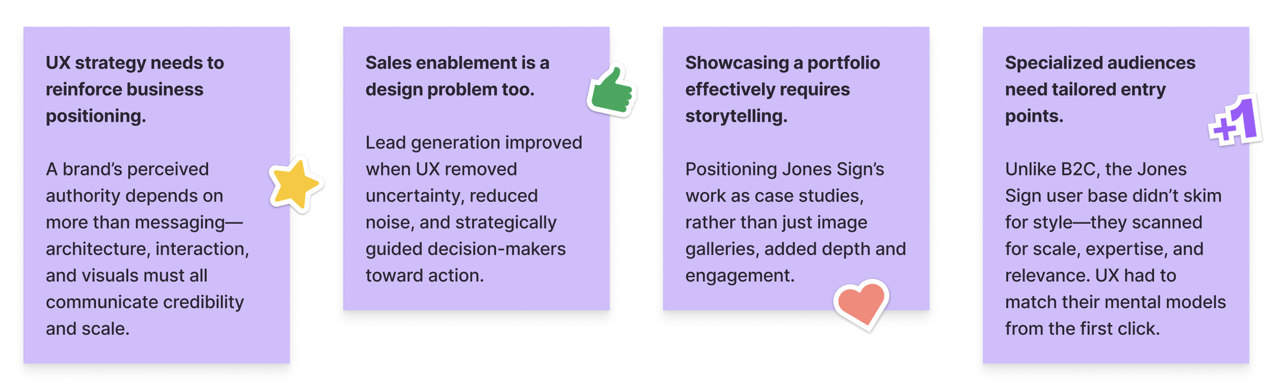
In future work, I’ll deepen early alignment practices to translate business complexity into UX clarity—ensuring that content structure and interaction flows are grounded in cross-functional priorities from day one.
The Real Win
Making decades of signage expertise feel modern, intuitive, and unmistakably best-in-class.
Referenced Frameworks & Reading
A few resources that influenced my approach on this project: