Kander: UX Strategy to Launch a Scalable Salesforce Consultancy Site
Kander is a Salesforce consultancy that helps businesses navigate digital transformation. They needed a brand-new website to clearly communicate their services and position them as trusted advisors. I led research and information architecture strategy, designed modular components, and built a scalable foundation—turning a blank slate into a confident digital presence.
From zero to scalable: building trust, structure, and messaging in just 6 weeks
The Challenge: An Underwhelming Digital Presence
Kander had a basic website, but it failed to convey credibility or differentiate the firm in the crowded Salesforce consulting market. Instead of reinforcing trust, the site blended into the background—generic in design, vague in messaging, and with limited pathways for potential clients to take action.
Key issues included:
Generic Messaging – Content relied on broad claims without highlighting Kander’s specific expertise.
Unremarkable Visual Design – Outdated styling and stock-like imagery didn’t convey innovation or trust.
Low Engagement Opportunities – Calls-to-action were minimal and buried, leaving visitors with little reason to connect.
We needed a content-led UX strategy that elevated Kander’s authority, clarified its offerings, and gave potential clients a clear, confident next step.
Original Kander website: generic and dated, with minimal clarity or conversion opportunities.
My Role in This Project
I led end-to-end UX and visual design for the redesign of Kander’s website—elevating a basic, underpowered site into a scalable digital presence that reflected the firm’s expertise and credibility.
Working in a fast-moving, agile team, I partnered closely with Kander’s leadership to guide discovery, refine the information architecture, and design modular components that aligned seamlessly with messaging and content strategy. From wireframes to polished UI, I created a flexible design system that established trust from the very first interaction—while making future updates simple and sustainable.
While this case study focuses on my full-spectrum design contributions, the project’s success was deeply collaborative—spanning brand strategy, content, and executive input. Contributors are listed below.
Designing for — Companies Vetting Salesforce Partners
Kander’s existing website wasn’t setting them apart—it looked generic and failed to build confidence. Their prospective clients weren’t browsing casually; they were actively searching for a Salesforce consultancy with the credibility and capacity to support mission-critical systems. The redesign needed to shift first impressions from “basic presence” to “trusted partner,” communicating clarity, capability, and confidence from the very first click.
We focused on a single, high-stakes audience:
Operational Stakeholders Leading Vendor Selection
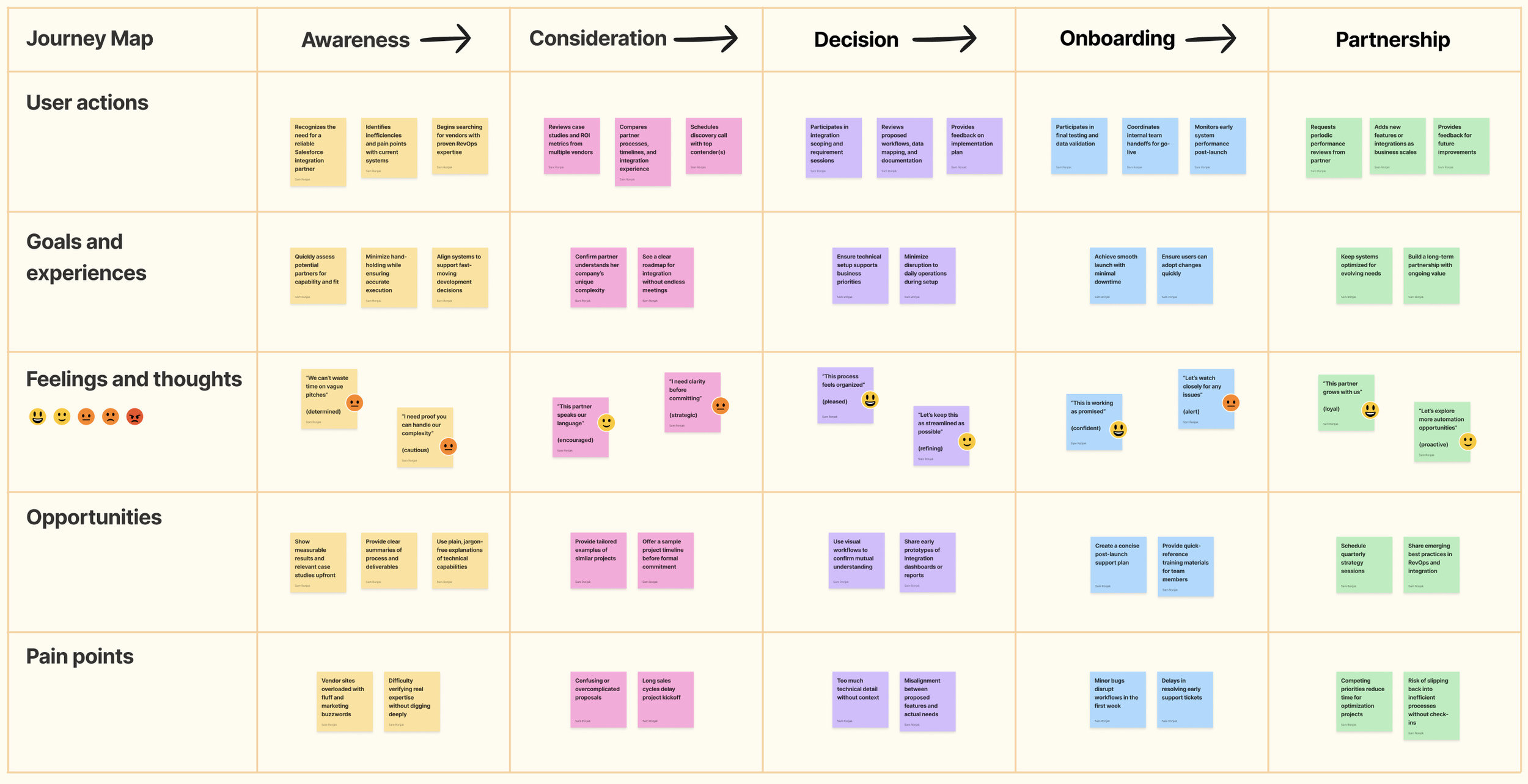
These users—often IT managers, RevOps leads, or digital transformation sponsors—were under pressure to identify a partner who could plug in quickly and deliver results without extensive hand-holding. They needed streamlined messaging, a clear understanding of service offerings, and immediate confidence that Kander could execute.
To align the site experience with their needs, I anchored the UX strategy around a lean but focused persona: Maya. Her goals, concerns, and expectations informed the site’s hierarchy, tone, and structure—ensuring we weren’t just presenting a vendor, but positioning Kander as a reliable, long-term partner built to scale with the business.
The Solution: Redesigning a Digital Presence Worth Trusting
Kander already had a website, but it lacked clarity, credibility, and impact. To help them compete in a crowded Salesforce consulting space, we needed more than a facelift—we needed a foundation that projected authority, supported storytelling, and gave clients confidence from the very first scroll.
Our approach focused on three priorities:
A Structure That Supports Storytelling – We translated Kander’s strengths into an information architecture that unfolded with purpose—starting with a sharp, benefits-focused homepage and guiding users through services, outcomes, and proof of expertise. Each section was designed to reinforce trust and clarity.
Scalable Design and Content Systems – Kander’s internal team needed autonomy after launch. I built modular page components and content patterns that empowered them to create new pages and update messaging—without relying on a designer.
A First Impression That Feels Established – Instead of looking like a generic template site, the redesign presented Kander as an experienced, credible partner. The clean, professional visual design paired bold confidence with startup energy, striking the balance between credibility and agility.
The result was a digital presence that didn’t just introduce Kander—it elevated them, positioning the firm as a trusted Salesforce consultancy with room to grow.
The Process & What I Did
Audit the Starting Point
Goal: Evaluate Kander’s initial site and content to identify gaps in clarity, scalability, and trust-building.
Although Kander already had a basic site in place, it wasn’t supporting their goals as a Salesforce consultancy. The structure was minimal, content was fragmented, and the design failed to communicate credibility. I mapped the site’s strengths and shortcomings, noting what could be repurposed and what needed rethinking. This gave us a baseline to build from without assuming we were starting from zero.
Clarify the Audience Needs
Goal: Define what prospective clients looked for when evaluating Salesforce partners.
Through workshops with leadership and competitive analysis, I identified the factors prospective clients cared most about: proven expertise, clear service offerings, and signals of trust. These findings guided both the information architecture and the storytelling approach, ensuring the new site aligned with client expectations from the first click.
Shape the Content Framework
Goal: Translate Kander’s value proposition into a structure that guided users from curiosity to confidence.
I created an information architecture that highlighted Kander’s differentiators early, then layered in service details, proof points, and client logos. This structure ensured that even a quick skim would surface credibility, while deeper exploration reinforced expertise. By aligning navigation and page flows to client decision-making, the site became a tool for persuasion, not just presentation.
Design Modular Components
Goal: Build a flexible design system that balanced professionalism with startup energy.
The visual language was built to project confidence—clean typography, strong layouts, and scalable components that could grow as Kander added services or case studies. Each module, from hero banners to testimonial blocks, was designed to be reusable and easy to update, giving Kander autonomy post-launch.
Prototype & Iterate with Stakeholders
Goal: Validate design decisions with leadership and refine based on feedback.
Low- and mid-fidelity prototypes allowed Kander’s leadership to interact with the evolving site early. Their feedback helped refine messaging tone, prioritize which proof points to highlight, and balance technical detail with approachability. Iterating collaboratively built confidence and alignment, ensuring the final product reflected both client needs and internal vision.
Prepare for Long-Term Growth
Goal: Ensure the site could scale with Kander’s evolving services and client base.
Beyond launch, I documented component usage and trained the internal team on how to extend the site with new case studies, services, or updates. By combining a modular design system with straightforward content patterns, the site provided both credibility in the present and flexibility for the future.
The Outcome: A Confident First Impression—and Room to Grow
Kander’s new site delivered on every front: It positioned them as a trusted partner, gave their team the tools to scale, and converted interest into pipeline from day one.
✅ Instant Credibility — Clients described the site as “clean, clear, and confident”—a dramatic shift from having no online footprint to making a polished, professional first impression.
✅ Clear, Actionable Messaging — Content and UX worked together to guide prospects through Kander’s services and value. Site visitors could quickly understand what Kander does, why it matters, and how to get started.
✅ A Scalable System — Because the site was built modularly, Kander’s team can now add new services, success stories, and content without compromising design integrity.
✅ High Engagement from the Start — Within the first week of launch, the team received direct outreach from potential clients—validating the site's clarity and strategic focus.
“We didn’t just need a website—we needed a clear way to explain who we are and how we work. This gave us a professional foundation that feels true to the way we show up for clients.”
Project Team
This project combined UX design, content strategy, creative direction, and digital strategy to help a growing consultancy sharpen its messaging and elevate its digital footprint.
Scope & Constraints
Scope:
This project involved creating a complete digital presence for Kander, a new consulting firm with strong expertise but almost no existing brand infrastructure. I led UX strategy and design from the ground up—defining content architecture, visual direction, and modular components that would support long-term scalability.
The goal was to launch a site that built immediate credibility, reflected Kander’s professionalism, and could grow with the business.
Constraints:
No Existing Brand Assets: Aside from a logo, there were no visual guidelines, typography, or tone documentation—so foundational brand definition had to happen before high-fidelity design could begin.
Lack of Original Photography: Without professional imagery, we had to rely on carefully curated stock assets and layout strategies to preserve visual polish.
Lean Team, High Stakes: As Kander’s first public site, every page carried weight. The design needed to communicate trust and expertise without overwhelming a small team’s future capacity.
Startup Ambiguity: As the business model and messaging continued to evolve during the project, we built scalable systems and flexible templates to adapt without constant redesign.
Lessons Learned
This project emphasized the importance of research-led UX in service-oriented B2B platforms.
My biggest takeaways include:
In future builds for early-stage consultancies, I’d treat content structure not just as a delivery layer—but as a strategic asset. Aligning modular components with messaging pillars from the start ensures scalability without compromising clarity or trust.
The Real Win
Delivering a scalable foundation that empowers Kander to grow—without growing their dev backlog.
Referenced Frameworks & Reading
A few resources that influenced my approach on this project:


