From Friction to Flow: UX Strategy for a Clean Energy Enrollment Experience

CleanChoice Energy offers clean power plans to residential and business customers — but their enrollment experience wasn't keeping pace with their ambitions. Confusing content architecture and an outdated page structure were creating friction at exactly the moment users needed clarity and confidence to commit.
I led the UX strategy to diagnose where and why users were dropping off, restructure the enrollment flow, and design a more intuitive, modular experience that supported faster decision-making and greater trust in the product.
The engagement extended beyond the enrollment flow — encompassing the broader website experience to ensure consistency, credibility, and a unified content architecture across key campaign pages.
The result: a clean energy experience that finally matched the clarity of the mission itself.

The Challenge: Friction-Filled Enrollment and Messaging Gaps
CleanChoice Energy had a compelling product — but the digital experience wasn't converting interest into action. The site struggled to guide users toward confident sign-up, and research quickly surfaced why.
Plan Comprehension — Users couldn't easily understand what they were signing up for, what it would cost, or why it mattered for their household.
Enrollment Friction — A fragmented, multi-step flow created confusion and drop-off at the moments that mattered most.
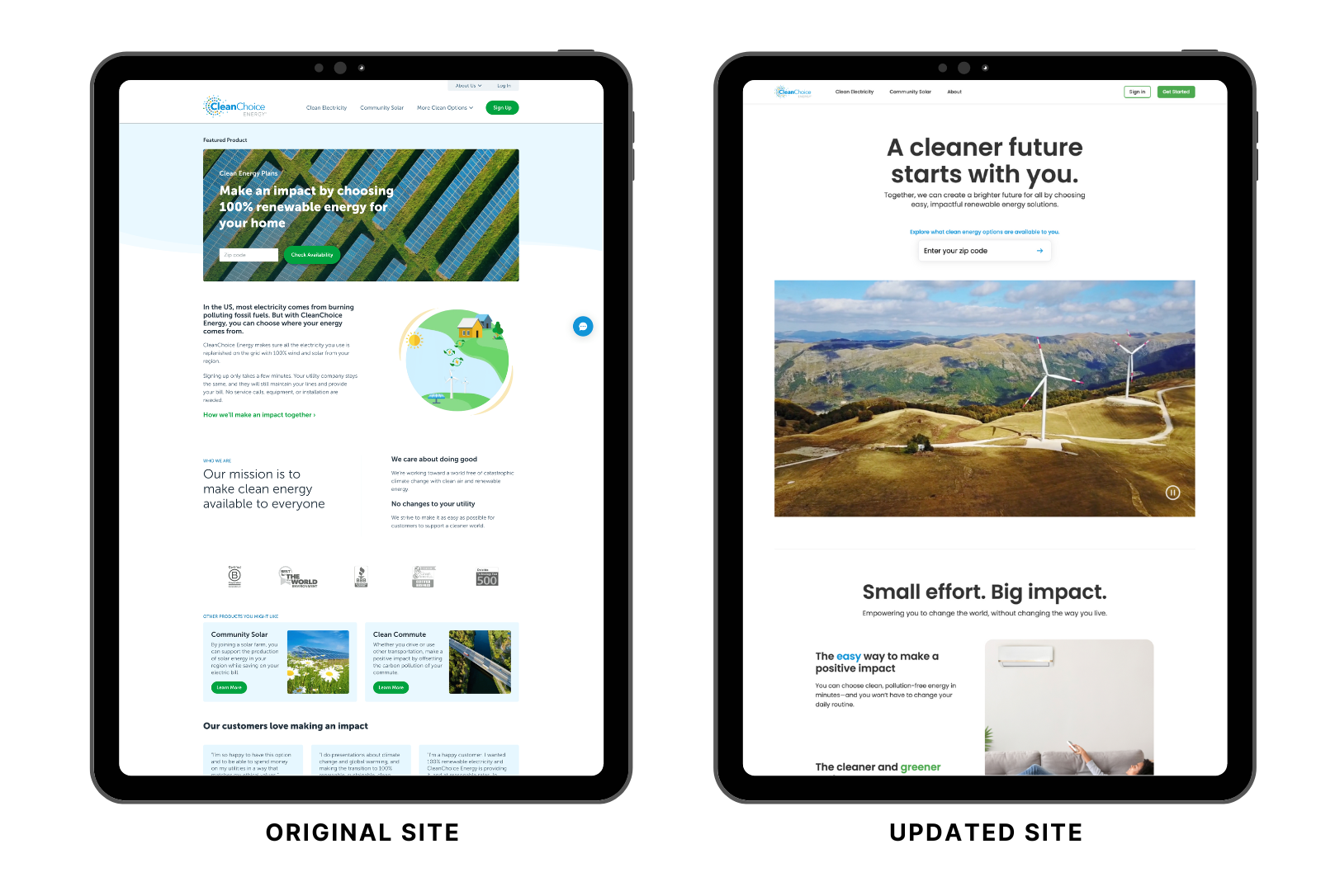
Brand Credibility Gap — The visual experience didn't reflect CleanChoice's mission or position them as a modern, trustworthy energy alternative.
These weren't isolated UX problems — they were compounding each other, eroding trust at every stage of the funnel.
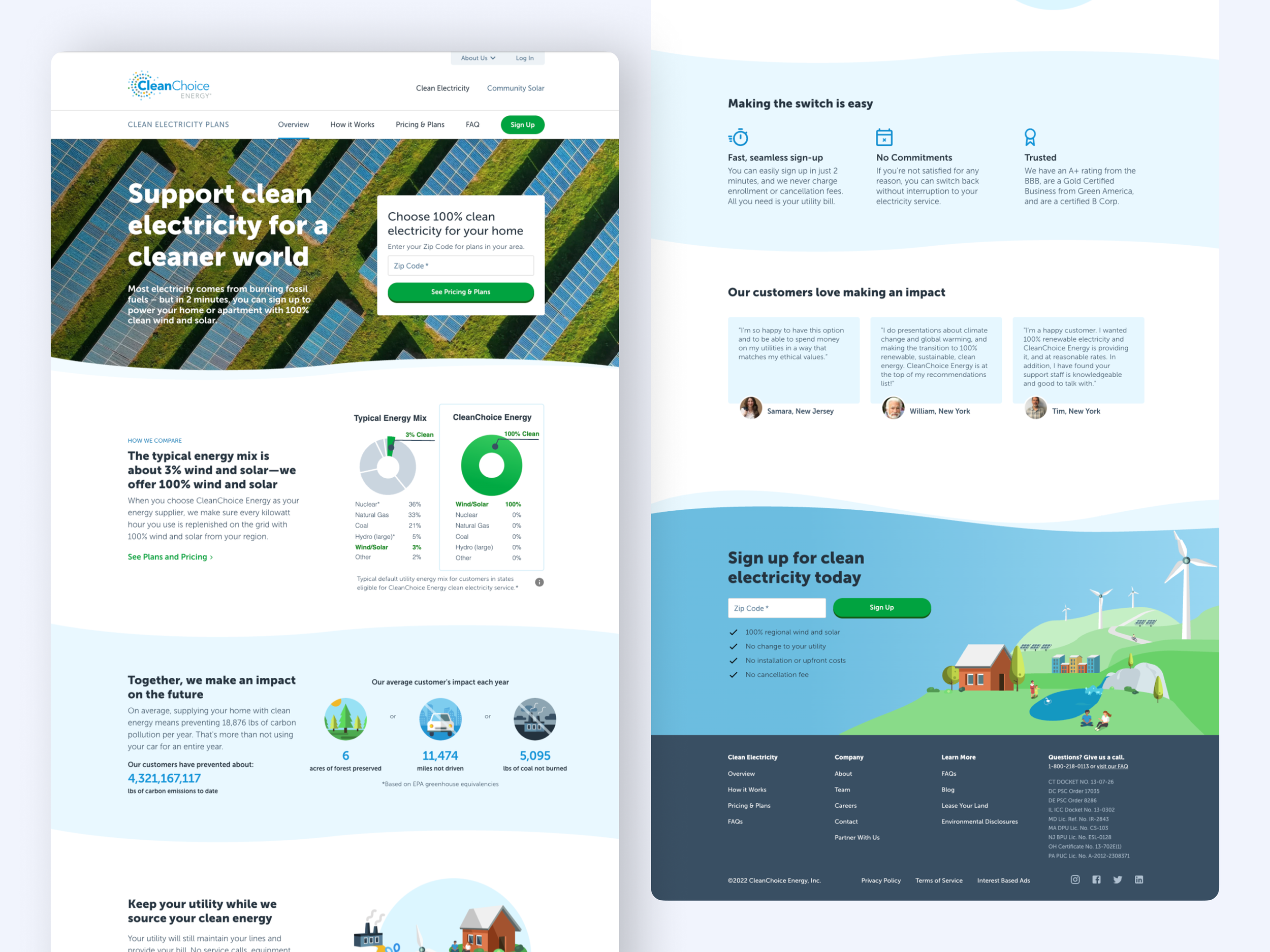
Original landing page — dense copy and unclear next steps created friction before users ever reached enrollment.
My Role in This Project
I led UX strategy, research, information architecture, and visual design for this engagement — taking strong ownership over both the process and the final output while working in close collaboration with the VP of Design.
In practice that meant conducting user research and testing, restructuring complex enrollment workflows, and developing reusable design patterns that elevated brand credibility across the site.
This case study reflects my design leadership within a broader cross-functional effort — full team credits below.
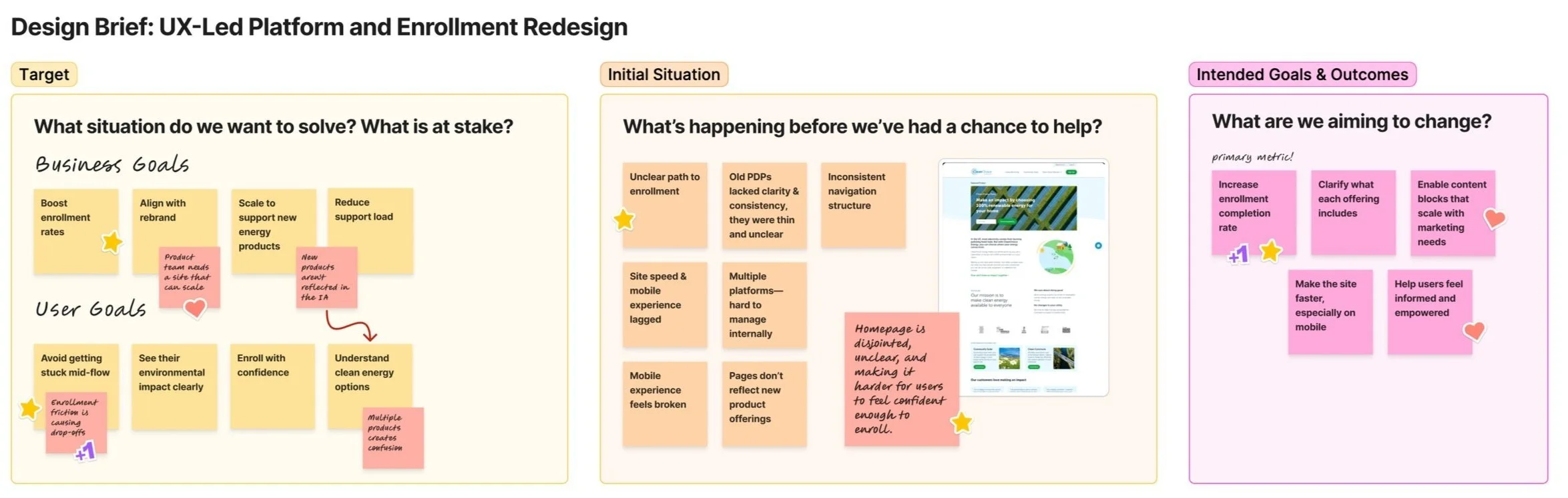
This early design brief helped align business goals, user outcomes, and interface priorities across teams—providing a shared North Star before implementation began.
Designing for — Climate-Conscious Customers Seeking Simplicity
CleanChoice Energy's experience had to do more than explain clean energy — it had to convert genuine interest into confident action. For many potential users, the motivation to make environmentally responsible choices was already there. What was missing was trust in the process.
Two user profiles shaped the work:
The Overwhelmed Environmentalist — Cares deeply about sustainability but finds energy choices confusing and time-consuming. Needs jargon-free explanations, transparent pricing, and an enrollment path that doesn't require a phone call.
The Values-Driven Homeowner — Motivated by climate impact and community benefit, but needs the experience to feel modern and credible enough to match their identity as an informed decision-maker.
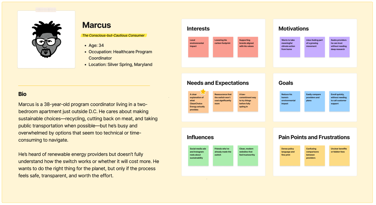
We anchored the work in a flexible composite persona — Marcus — to keep design decisions grounded in lived behavior: limited time, high curiosity, and a strong desire to do good without unnecessary friction.
Scope & Constraints
This project focused on rapidly improving CleanChoice Energy's enrollment experience ahead of a major marketing push — auditing content, identifying journey friction points, and designing UX updates that would increase clarity, trust, and conversion without requiring backend changes.
The goal was an experience that made CleanChoice feel not just like the right choice, but the easy one.
Constraints:
Accelerated Timeline — The project ran on a tight schedule tied to upcoming ad campaigns, requiring fast alignment across design, marketing, and executive stakeholders.
Frontend-Only Changes — Technical limitations meant all improvements had to work within the existing frontend structure, demanding precise, high-impact design decisions.
Legacy Architecture — Layout flexibility was limited, so the work focused on content hierarchy, microcopy, and visual consistency to guide users more effectively.
Conversion Pressure — Enrollment was underperforming despite strong user interest, so every UX decision had to reduce friction without overwhelming users with information.
The Solution: A Research-Led UX Strategy to Simplify Enrollment
The work centered on four interconnected streams — each addressing a distinct layer of the friction we'd diagnosed in research:
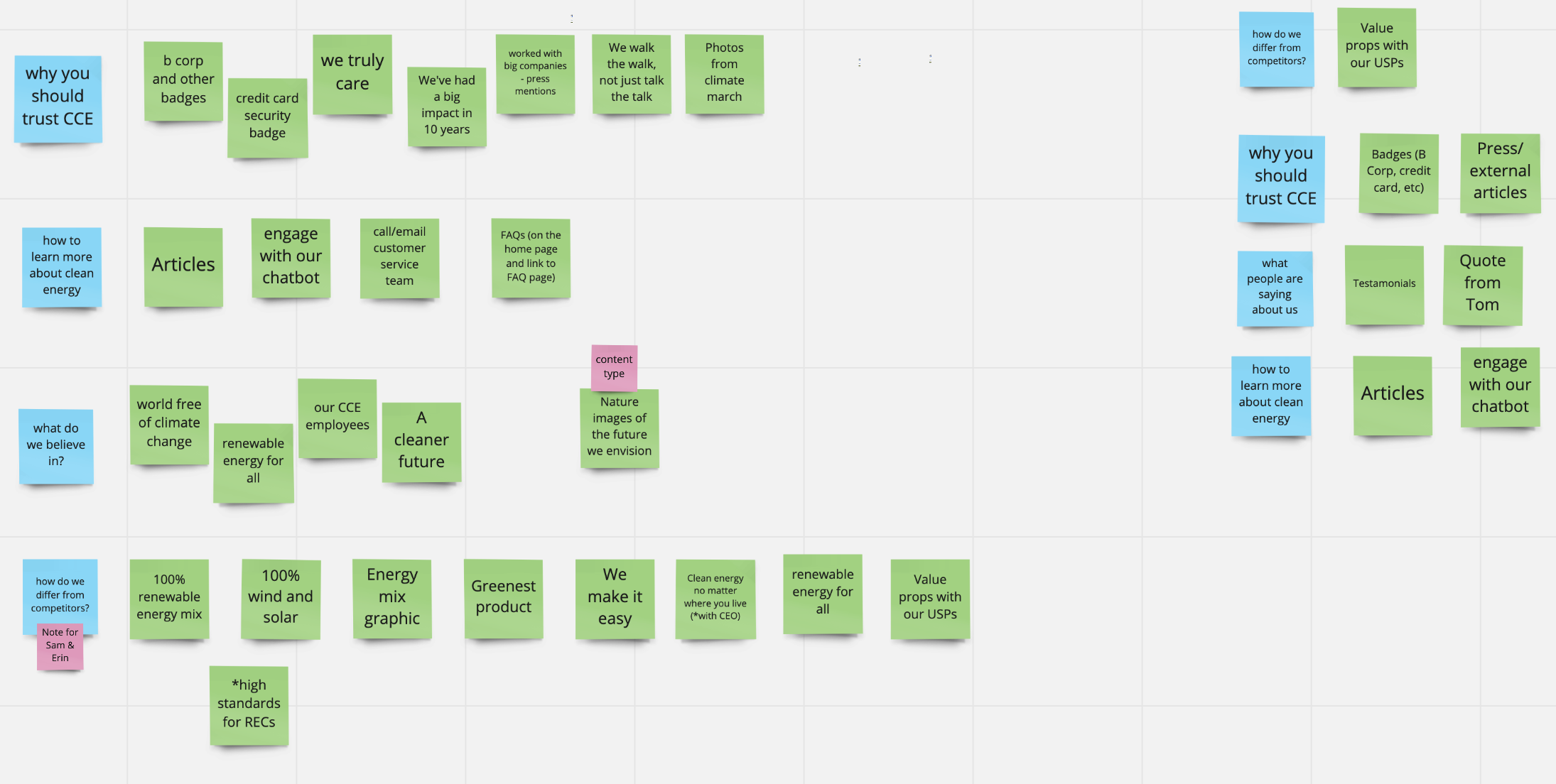
User Research & Competitive Analysis — Conducted interviews and benchmarked competitors to map where and why users were losing confidence in the enrollment journey.
Information Architecture — Restructured site navigation to make plan comparisons clearer and reduce the cognitive load of understanding what CleanChoice actually offers.
Enrollment Flow Redesign — Simplified and sequenced the sign-up process to remove unnecessary steps and make the path to commitment feel achievable.
Prototyping & Usability Testing — Iterated on high-fidelity prototypes through multiple rounds of testing, refining until the flow felt genuinely intuitive.
Together these streams turned a fragmented experience into one that earns user trust early and sustains it through to sign-up.
The Process & What I Did
Pinpoint the Enrollment Drop-Offs
Goal: Understand where users abandoned the enrollment flow and why, using analytics and behavioral data.
I started by auditing funnel analytics to see where users most often abandoned enrollment. The steepest drop-offs happened during address entry and again when comparing plan options. Session replays and heatmaps confirmed why: error states were unclear, users questioned whether their address qualified, and plan details were presented in overwhelming blocks of text.
These insights reframed the challenge. The issue wasn’t just that users quit randomly — abandonment clustered around points of friction where confidence broke down. With that clarity, I could focus the redesign on reducing cognitive load and guiding users through these high-risk moments.
Map User Journeys & Pain Points
Goal: Clarify which customer segments struggled most, and where their needs diverged within the enrollment experience.
With personas defined, I mapped their paths through the existing enrollment flow to see where intent broke down. Analytics had already shown drop-offs, but journey mapping revealed why those moments created friction.
Conscious-but-Cautious Renters (like Marcus, above): These users entered the flow with high motivation but lost momentum quickly. Their journey often stalled at the address-entry and plan comparison screens. Error messages were unclear, dense fine print created hesitation, and the lack of upfront reassurance about cost left them uncertain if it was safe to continue.
Values-Aligned Homeowners: These users made it further in the flow, but frequently lingered on plan comparison. They wanted to evaluate environmental impact and trustworthiness as much as price, yet the current design treated those considerations as secondary. Without clear cues, they either delayed completion or dropped out to “do more research.”

Across both journeys, the pattern was consistent: initial curiosity turned into hesitation when the flow demanded more effort than confidence it returned. Where one group felt overwhelmed, the other felt under-informed. Visualizing these divergences showed the flow had to flex — guiding newcomers with clarity while giving more informed users the depth they needed to act with confidence.
Simplify the Information Load
Goal: Reduce friction by restructuring dense, confusing content and breaking it into digestible, decision-ready steps.
The existing design asked users to make high-stakes decisions while reading through long, paragraph-heavy content. I restructured the information architecture into progressive disclosure: bite-sized steps with optional details available on demand.
Key plan features like rate, contract length, and cancellation terms were distilled into scannable bullets, supported by icons and emphasis treatments. Supporting details and legal language were layered in contextually instead of front-loading everything. This shift turned walls of text into manageable steps, helping users focus on one decision at a time.
Prototype a Leaner Path
Goal: Design a streamlined enrollment flow that guided users with fewer steps and clearer actions.
With the new structure in place, I built low-fidelity wireframes and clickable prototypes to test how a leaner flow would feel. The focus was on creating a linear, reassuring path: confirm eligibility, select a plan, enter details, finalize.
Each screen highlighted a single clear action, with secondary options tucked into expandable sections. Error messages were rewritten in plain language with guidance on how to recover. By reducing both the number of steps and the friction within each one, the prototype demonstrated a faster, more confident path to completion.
Validate with Real Users
Goal: Ensure improvements reduced confusion and supported successful completion through usability testing in context.
I ran usability sessions with a diverse set of target customers, testing the prototypes across devices. Observing participants navigate in real contexts highlighted both successes and refinements.
Users moved more smoothly through the address entry step, and nearly all completed plan selection without hesitation. Feedback confirmed that simplified plan summaries increased trust, especially when cancellation terms were surfaced earlier. Small copy tweaks — like clarifying “no hidden fees” — had an outsized impact on confidence.
These sessions validated that our changes reduced abandonment drivers and improved completion rates.
Set Metrics for Ongoing Tracking
Goal: Enable the team to monitor drop-off and conversion data long after launch, ensuring ongoing optimization.
To make sure improvements stuck, I collaborated with the analytics team to define post-launch metrics. Funnel tracking captured completion rates by device, while dashboards flagged where drop-off persisted. We also monitored time spent on plan comparison screens, error frequency, and abandonment during payment submission.
By embedding UX metrics into daily reporting, CleanChoice gained a sustainable way to track user success beyond a single redesign. This shifted the culture toward continuous optimization — treating the enrollment flow as a living product rather than a static form.
The Outcome: Increased Conversions & Streamlined Enrollment
This wasn’t just a redesign—it was a strategic overhaul that made it easier for users to choose clean energy, while giving internal teams a platform they could trust and scale.
✅ 20% Increase in User Satisfaction — Clearer product differentiation and intuitive navigation helped users feel more confident about their choices.
✅ Smoother, Faster Enrollment — A reworked flow reduced friction and drop-off, making it easier for users to complete sign-up with minimal confusion.
✅ Better Understanding, Bigger Impact — Improved content clarity helped users understand the environmental impact of their choices—boosting engagement and trust.
✅ Scalable Foundation for Growth — The flexible UX framework supports future energy offerings and evolving regulatory requirements without starting from scratch.

“Our new homepage and Clean Electricity product page are not only visually elevated—they’re also significantly faster. Page speed alone jumped from 64 to 98, which is a huge improvement for usability and retention.”
“The new site looks and performs amazing. I popped on there early this morning, having forgotten about the update, and gasped at my desk at how great it looked!”
Project Team
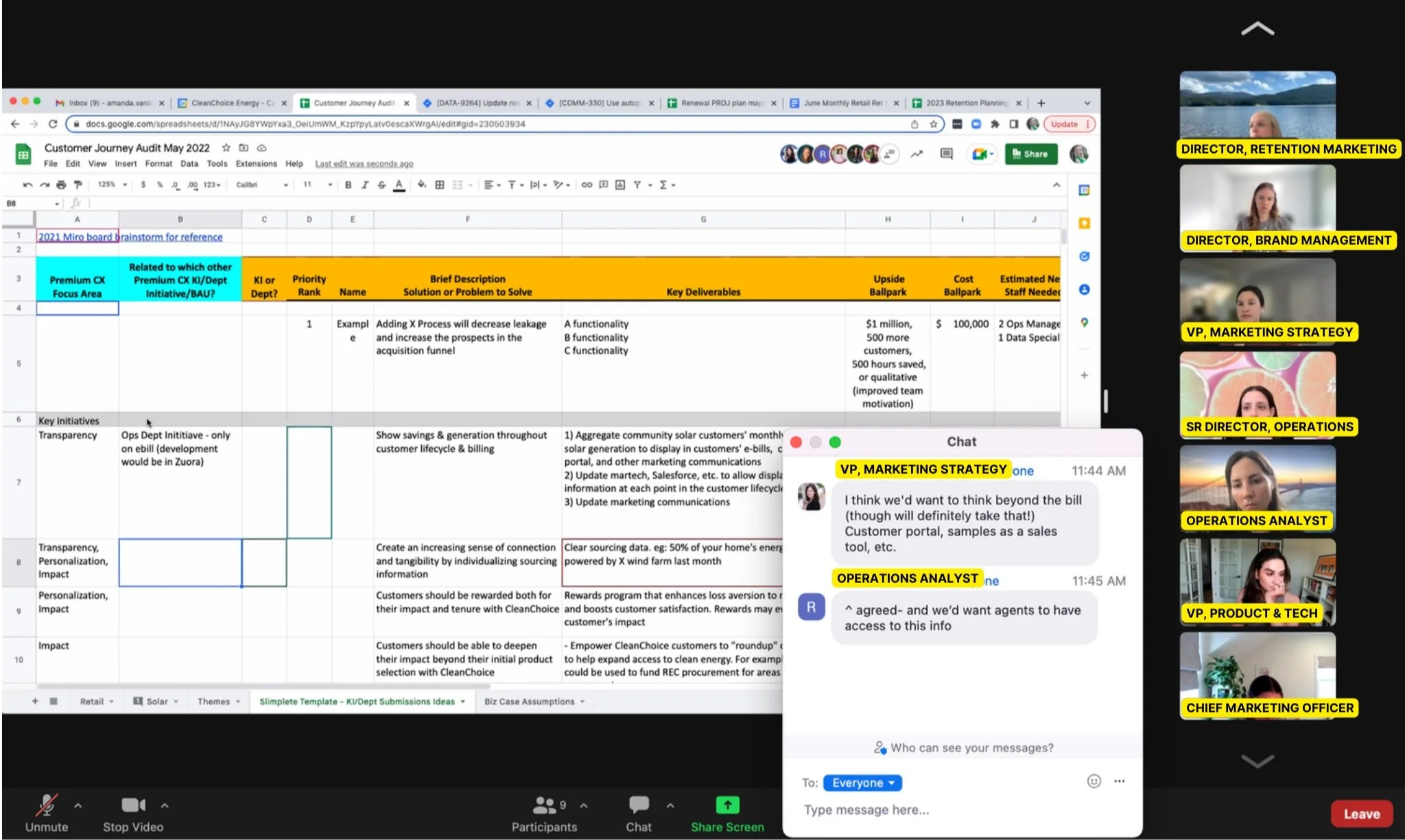
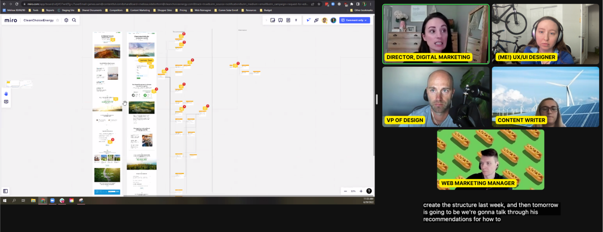
This project was a cross-functional effort — spanning UX, product design, marketing, and engineering — with close collaboration at every stage of the process.


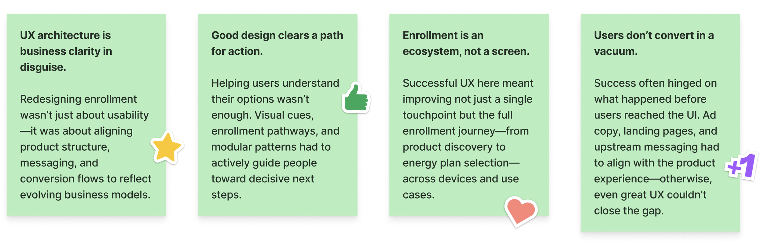
Lessons Learned
Through this project, I gained key insights into designing scalable digital experiences for renewable energy consumers.
Some of my biggest takeaways include:
For future enrollment platforms, I’ll prioritize continuous optimization through behavioral analytics—leveraging heatmaps, session recordings, and journey metrics to surface friction, refine decision paths, and sustain long-term conversion gains.
The Real Win
Helping users choose renewable energy with clarity and confidence—by simplifying everything behind the scenes.
Referenced Frameworks & Reading
A few resources that influenced my approach on this project: