Clarity at Scale: Building a Design System to Unify Internal Tools Across Teams
EDF’s PowerBI dashboards help teams across the company visualize performance data, share insights, and make critical decisions. But without consistent UX patterns, the tools felt fragmented—slowing workflows and eroding trust in the platform.
I led the UX strategy to build EDF’s first internal PowerBI design system: creating modular components, scalable documentation, and visual standards that supported clarity across tools and teams.
This wasn’t just a style refresh—it was a strategic foundation for faster delivery, better adoption, and cross-functional alignment at scale.
The Challenge: Inconsistent UX Undermining Data Confidence
EDF needed a scalable, design-driven strategy to bring consistency and clarity to its suite of internal PowerBI tools. Across renewable energy teams, visual fragmentation was eroding trust and slowing adoption.
Inconsistent Visual Standards – Teams used varying styles and patterns, leading to confusion and misalignment.
No Shared Component Library – Designers and developers lacked reusable assets, increasing build time and errors.
Limited Scalability – Updates required manual coordination, making it hard to scale improvements across tools.
To restore confidence in internal analytics, the project focused on creating a centralized design system—one that could flex across tools while reinforcing visual integrity and user trust. I championed this initiative from the ground up, showing teams how a unified design approach could solve a range of pain points they hadn’t yet connected.
EDF’s initial visual standards were built for external branding, but lacked the components and structure needed to support complex internal tools.
My Role in This Project
I led UX strategy and design system architecture for this internal analytics initiative—establishing a modular framework that unified data visualization tools across EDF’s renewable energy teams.
Partnering with stakeholders across data, engineering, and governance, I created foundational user flows, component libraries, and interaction patterns to streamline reporting and reduce redundancy. I also helped align internal communication strategies and design governance protocols to support scalable adoption.
This case study highlights my systems thinking and strategic leadership within a complex data-heavy environment—made possible through close collaboration with teammates listed further below.
Designing for — Data-Heavy Teams Seeking Clarity at Scale
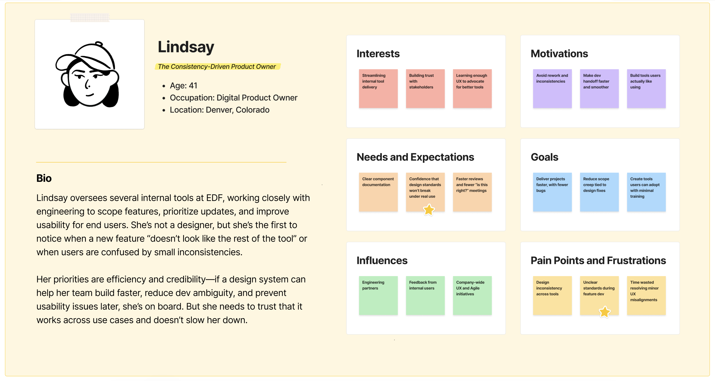
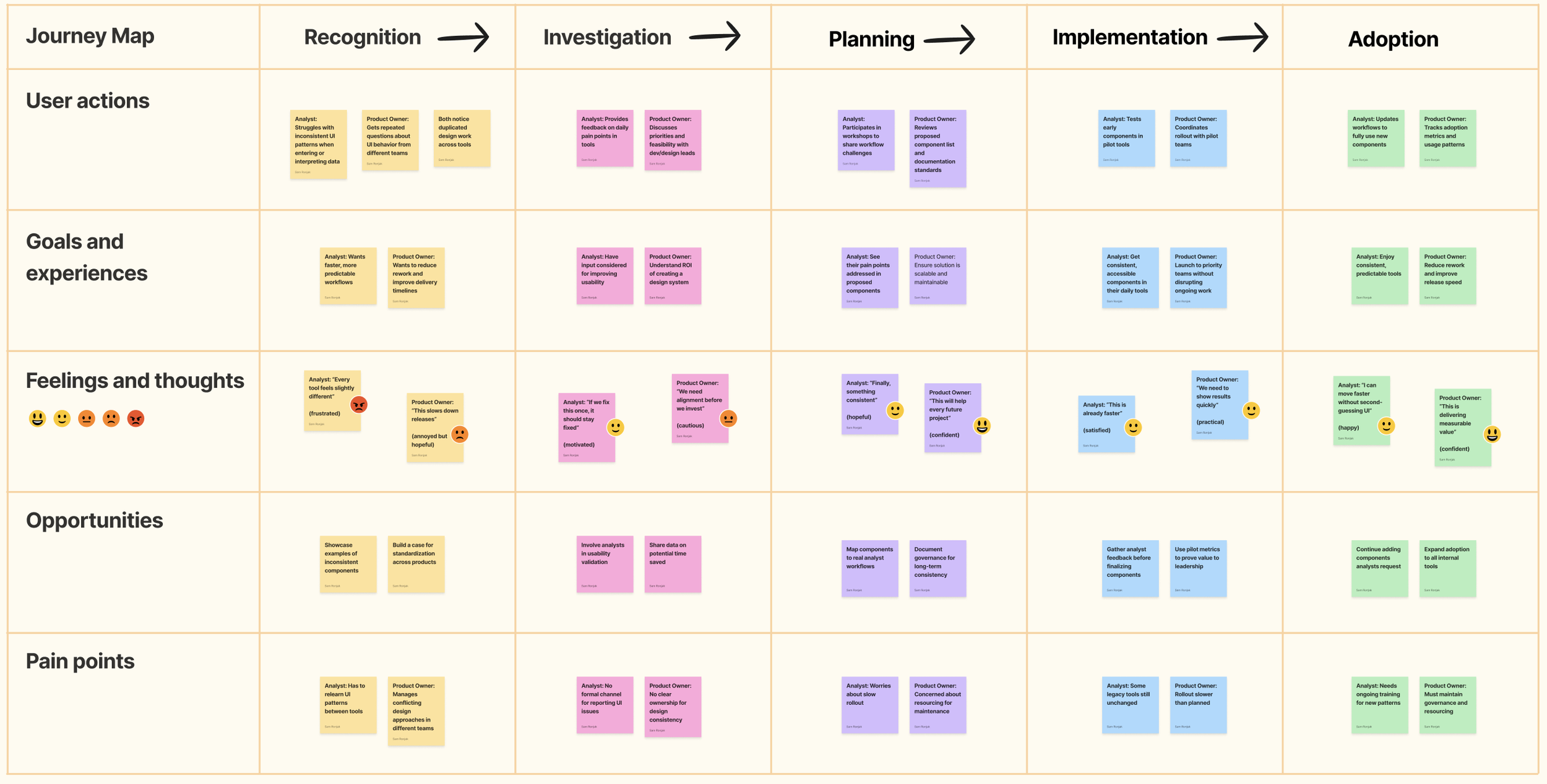
The PowerBI Design System wasn’t built for customers—it was built for EDF’s internal teams. Our users were analysts, engineers, product owners, and stakeholders across multiple renewable energy units—each with different tools, priorities, and reporting needs. What they had in common? Frustration with visual inconsistencies, redundant design effort, and a lack of shared standards.
Interestingly, none of our users were explicitly asking for a design system. Instead, I noticed recurring complaints across multiple teams—about duplicated effort, confusing visuals, and slow updates—and worked with colleagues to champion the design system as a unifying solution. This project didn’t just respond to a request; it reframed scattered pain points into a clear strategic opportunity.
Key user groups included:
Data & Reporting Analysts: These users needed clean, readable dashboards and reliable standards they could apply quickly across projects—without having to reinvent the wheel or make visual trade-offs.
Product Owners & Engineers: Responsible for delivering tools and features, this group relied on shared components and guidelines to reduce development time and avoid introducing inconsistency into already-complex workflows.
Our goal wasn’t just to document patterns—it was to earn adoption across teams. That meant scalable, user-tested systems that made good UX the default, not an extra step.
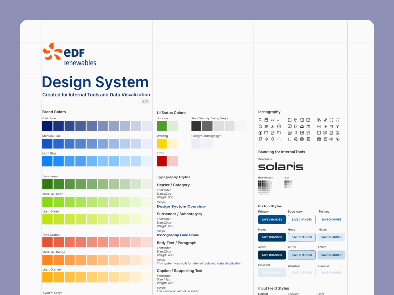
The Solution: A Modular, Scalable Design System Built from the Ground Up
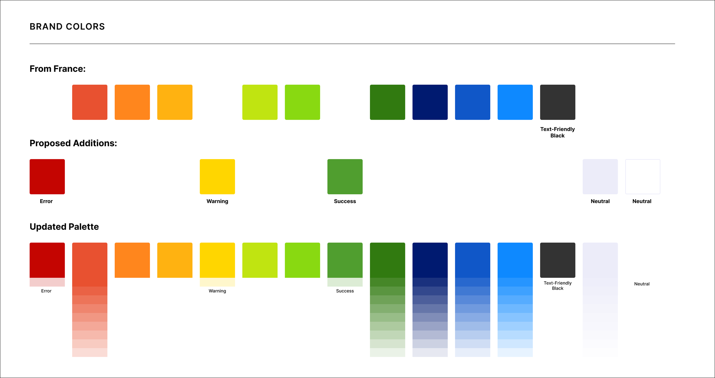
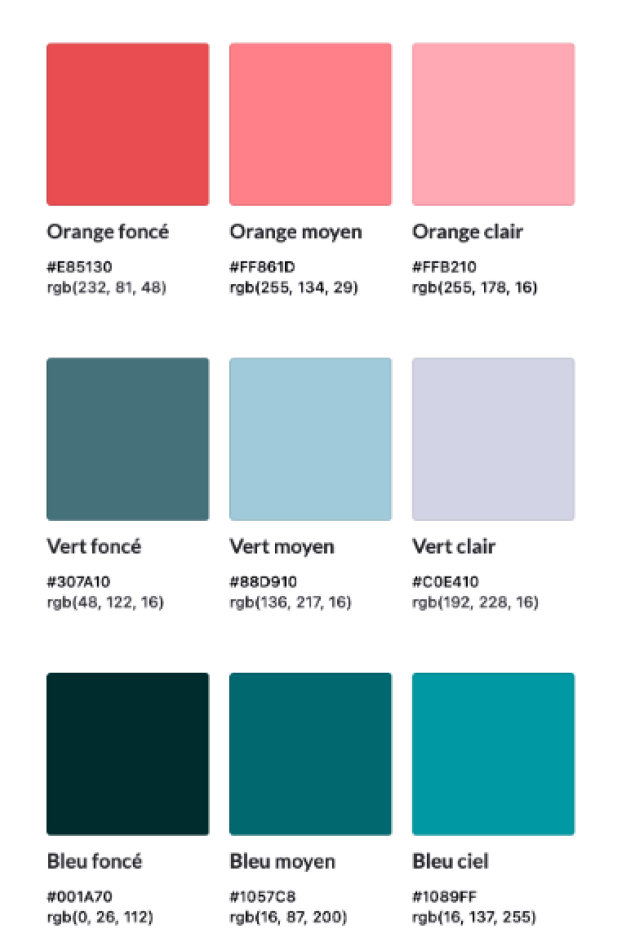
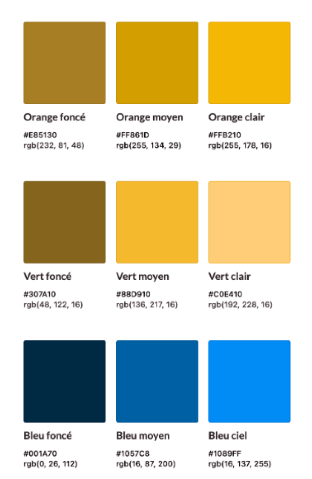
We began by introducing a set of system colors for error, warning, and success states. Next, we developed gradient scales for our primary brand colors—enabling their use as background fills without relying on full-strength, high-saturation tones.
The Process & What I Did
Review Existing Guidelines
Goal: Examine current brand and design documentation to identify gaps, inconsistencies, and missed opportunities for scalability.
Because PowerBI was used across EDF North America and its French parent company, we needed buy-in from global brand teams in Paris to align on any shared visual language. I led early-stage conversations to ensure that our internal design system could both respect existing brand standards and flex to meet the unique needs of analytics-heavy tools.
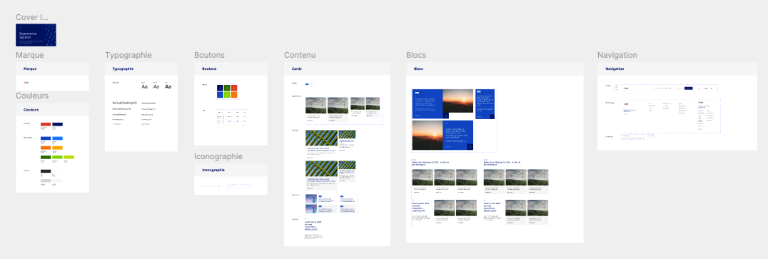
Screenshot from the “EDF-Experience_System-Librairie” Figma file—the only branding guidance available at project start. Created for EDF’s external-facing website, it offered minimal relevance to internal tools, requiring significant adaptation to meet the needs of our data-heavy, enterprise use cases.

EDF’s global brand palette emphasized bold, high-saturation tones, originally optimized for marketing collateral—not data-heavy enterprise tools. To ensure legibility and accessibility within analytics platforms like PowerBI, we needed to adapt and expand the system while maintaining brand alignment.
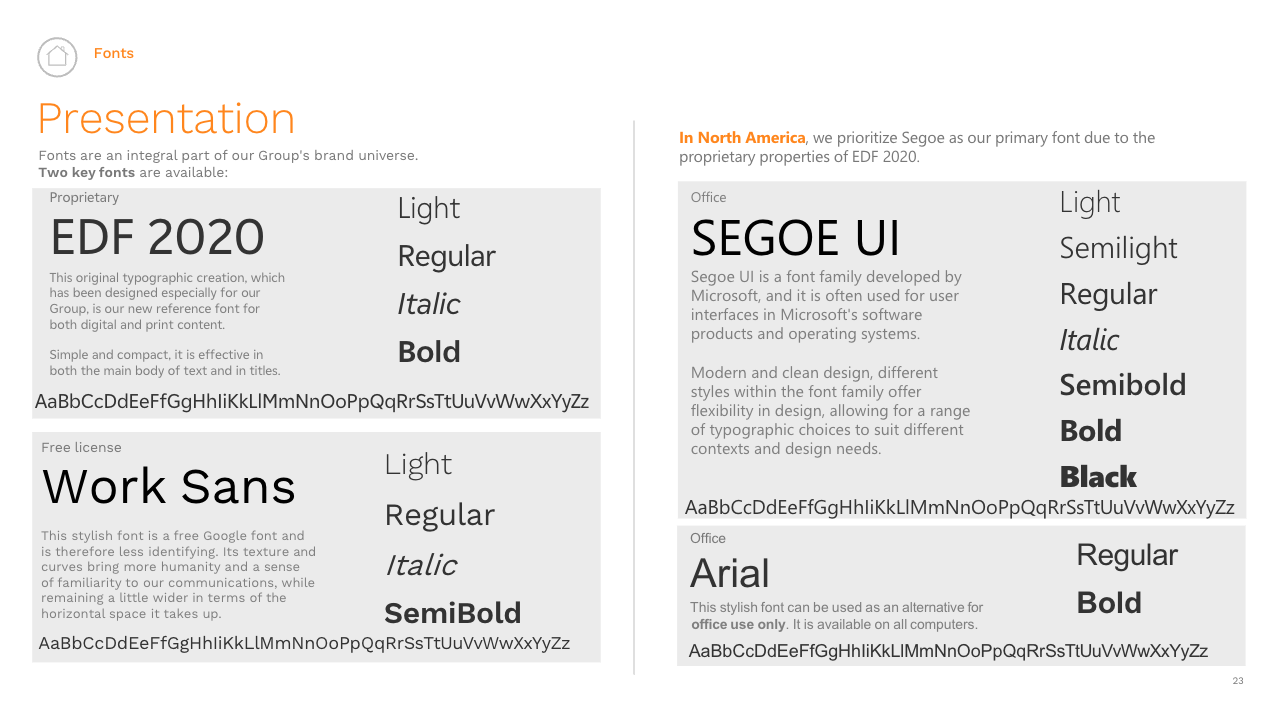
While Segoe UI had long been Microsoft’s default system font—and was recommended for EDF North America’s internal tools—we evaluated newer options that better supported legibility, visual consistency, and accessibility across data-heavy dashboards. With Microsoft’s rollout of Aptos, we proposed adopting it as our standard UI font to modernize the internal design system and improve user experience in Microsoft-based platforms like PowerBI.


Assess Current Tools
Goal: Map out overlapping styles, components, and UI patterns across internal platforms to uncover inconsistencies and friction points.
I began with a deep review of the existing internal tools, cataloging how colors, typography, layouts, and patterns were applied across different PowerBI dashboards. What emerged was a patchwork: one team leaned on default chart styles, another improvised with custom color palettes, and others modified spacing and typography in inconsistent ways. These divergences weren’t cosmetic—they actively hindered adoption and data trust. Documenting this landscape gave us a clear picture of how fragmentation was slowing decision-making.
Define Core Principles
Goal: Establish shared rules for color, typography, and hierarchy to guide consistent decision-making across teams.
From that audit, I worked with stakeholders to distill a set of guiding principles: consistency, legibility, scalability, and trust. These principles weren’t abstract—they translated into concrete standards for color use, text hierarchy, and visual balance across dashboards. By rooting every design decision in shared rules, we created a foundation teams could rely on, making it easier to align even when working independently.
Build the Foundations
Goal: Translate principles into reusable tokens and base components that teams could trust and scale.
Next, I established design tokens for color, type, and spacing—building blocks that could scale across contexts. These tokens ensured that a change to one value (for example, a brand color) would cascade consistently across all tools. By anchoring the system in this foundational layer, we gave teams confidence that every chart, table, or button was grounded in the same visual language.
Expand into Components
Goal: Develop higher-order UI components that reflected real workflows and supported accessibility needs.
With the base tokens in place, I moved into components that reflected real use cases: filters, tables, charts, and status indicators. Each component was designed with accessibility in mind, from color-contrast compliance to keyboard navigability. I tested them directly against the workflows of EDF’s analytics and operations teams to make sure they held up in complex, data-heavy contexts.
Document for Adoption
Goal: Provide clear, accessible guidelines so teams could easily apply the system in day-to-day work.
To bridge design intent with practical adoption, I built documentation that paired visual examples with usage rules. Rather than long manuals, the documentation took the form of concise, scannable guidance—helping engineers and analysts quickly understand when and how to apply each component. By embedding rationale alongside instructions, I equipped teams not just to follow the rules, but to make informed decisions.

Test & Refine with Teams
Goal: Validate usability and scalability of the system by piloting adoption and iterating on feedback.
I partnered with pilot teams to roll the design system into live dashboards, observing how the new components performed under real data conditions. Feedback loops were essential: some teams needed more flexibility in chart labeling, others requested streamlined filter interactions. Incorporating this feedback, I iterated on both the components and the documentation, ensuring the system supported real-world pressures.
Set Up for Evolution
Goal: Establish governance and versioning practices so the design system could adapt and grow sustainably.
Finally, I worked with leadership to define governance: who would approve updates, how versioning would be tracked, and how changes would be communicated across teams. This ensured the system wasn’t a one-time fix but an evolving foundation. By embedding processes for stewardship and iteration, we created a design system that could grow alongside EDF’s expanding portfolio of tools.
The Outcome: Skim-able Dashboards, Centralized Data, and UX that Scales
✅ 30% Reduction in Reporting Redundancy — By aligning UX patterns and prioritizing the most used metrics, we reduced duplication across dashboards and streamlined cross-team reporting.
✅ 87% Increase in User Satisfaction — Tailored training and continuous user research helped shape a system that felt intuitive—leading to stronger engagement and faster adoption.
✅ UX Consistency Across 25+ Dashboards — The centralized design system created a cohesive experience for analysts and business stakeholders alike, improving trust in the data.
✅ Scalable Framework for New Use Cases — We didn’t just clean up the current state—we built reusable patterns that made future dashboard creation faster, more consistent, and easier to govern.
Project Team
This project was a foundational collaboration across UX, data governance, and analytics, building a scalable design system to drive consistency and efficiency across EDF’s internal PowerBI tools.


Scope & Constraints
Scope:
This project focused on creating a centralized PowerBI design system to unify internal analytics tools across EDF’s business units. My goal was to establish reusable UX patterns, visual consistency, and governance structures that could scale across teams with different tool ownership and reporting needs.
While consistency was widely acknowledged as a need, the design system itself had to be proactively championed by the UX team—and only received formal support and dedicated build time in the final months of my role.
Constraints:
No Initial Buy-In or Time Allocation: The system began as a passion project, requiring internal advocacy and stakeholder education before securing formal support or resourcing.
Diverse Analytics Maturity: Stakeholders ranged from power users to part-time report owners, so patterns had to be flexible, inclusive, and easy to adopt across a spectrum of skill levels.
Global Brand Alignment: The system needed sign-off from EDF’s global brand team in France, introducing cross-cultural collaboration and brand governance nuances.
Unexpected Layoff Mid-Rollout: Although I wasn’t able to lead the system through full implementation, I delivered a clear, scalable foundation—equipping future teams to continue rollout with structured guidance and stakeholder clarity.
Lessons Learned
This project highlighted the challenges and opportunities of bringing UX maturity into a data-heavy enterprise environment. Key takeaways include:
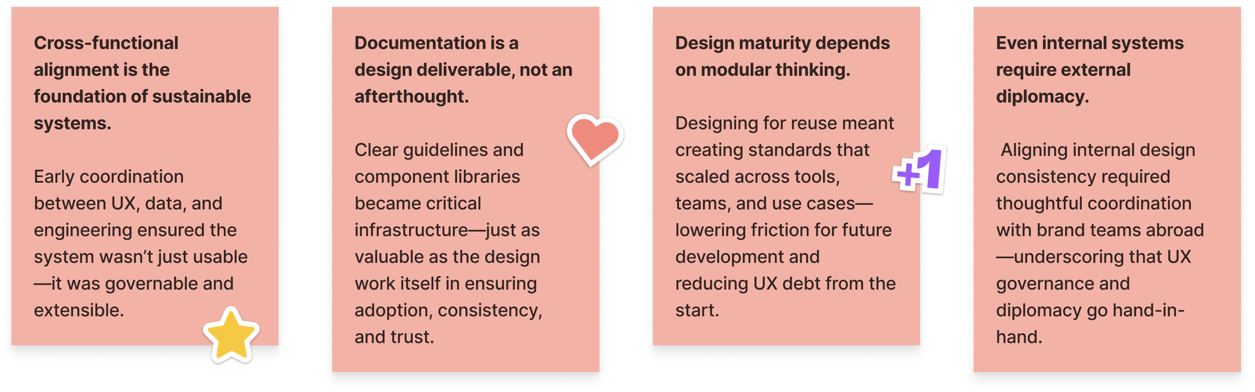
“While I was let go before the system’s full rollout, the design foundation, documentation, and stakeholder alignment I helped establish positioned the team to scale adoption independently. I remain proud of the systemic groundwork laid—and optimistic about its long-term impact.”
For future systems design, I’ll champion earlier analytics integration and structured feedback loops—enabling teams to track adoption, surface friction, and evolve governance strategies with confidence.
The Real Win
Scaling design clarity across a complex analytics ecosystem—so users can focus on impact, not interface.
Referenced Frameworks & Reading
A few resources that influenced my approach on this project:

