Salesforce UX for Land Operations: Bridging Fieldwork and Digital Tools
EDF’s land management teams rely on Salesforce to track parcels, landowners, and agreements across hundreds of development sites. But the system hadn’t kept pace with how teams actually worked—leading to friction, inefficiencies, and growing frustration across stakeholders.
I led the UX strategy to re-architect key workflows: restructuring layouts, aligning logic with team mental models, and designing scalable patterns that reduced confusion and supported trust in the system.
The result wasn’t just a better interface—it was a more confident, collaborative workflow for EDF’s land operations teams.
The Challenge: Replacing Legacy Systems with Scalable UX
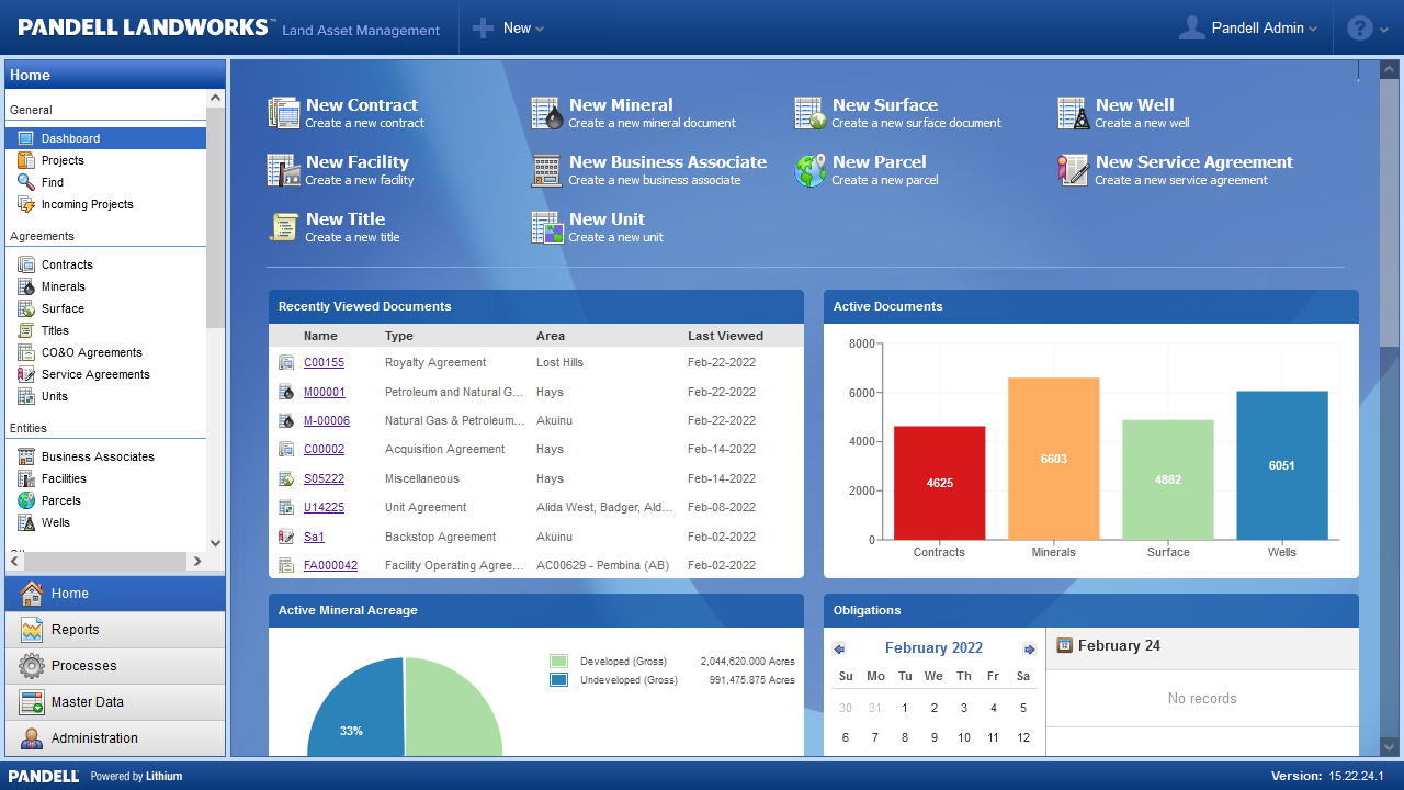
EDF’s land management teams were transitioning from LandWorks to a custom-built Salesforce platform. The shift promised stronger integration and long-term flexibility—but without a clear UX strategy, the new system risked replicating old friction in a new environment.
Task-Flows Buried in System Logic – Page layouts mirrored backend object structures rather than user workflows, making basic tasks harder than they needed to be.
Low Confidence in Data Entry – Unclear field groupings and inconsistent labels led to confusion, hesitation, and uneven adoption.
Underestimated Change Management – Teams accustomed to LandWorks needed more than a new interface—they needed context, clarity, and a system they could trust.
To make the transition successful, we had to design with user trust at the center—reframing the experience around real-world tasks, intuitive architecture, and scalable UX patterns. I led the strategic redesign to ensure the move to Salesforce wasn’t just technical—it was transformational.
Out-of-the-box Landworks interface, illustrating the kind of legacy system Salesforce was brought in to replace.
My Role in This Project
I led UX strategy and design system architecture for this internal analytics initiative—establishing a modular framework that unified data visualization tools across EDF’s renewable energy teams.
Partnering with stakeholders across data, engineering, and governance, I created foundational user flows, component libraries, and interaction patterns to streamline reporting and reduce redundancy. I also helped align internal communication strategies and design governance protocols to support scalable adoption.
This case study highlights my systems thinking and strategic leadership within a complex data-heavy environment—made possible through close collaboration with teammates listed further below.
Designing for — Coordinators Managing Complex, Evolving Relationships
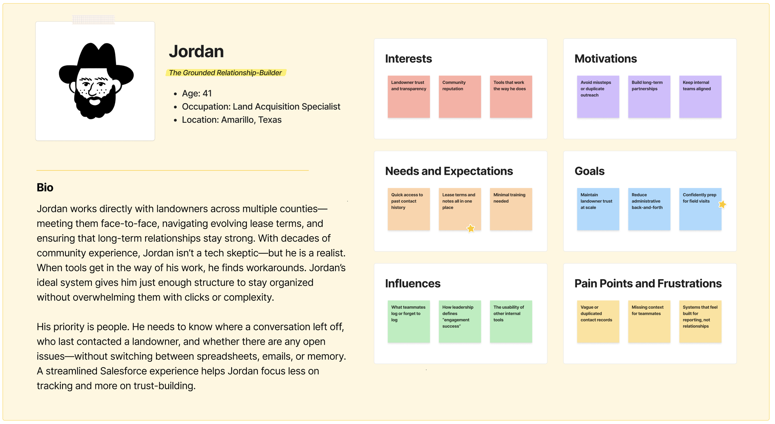
The Salesforce Contact Management System wasn’t about marketing pipelines—it was about people. Specifically, landowners, local communities, and long-term partners whose involvement could make or break renewable energy projects. Our internal users needed a way to track, organize, and act on nuanced stakeholder data—without losing context, duplicating effort, or creating bottlenecks.
Our approach centered on empowering internal teams with tools that felt like extensions of their workflows—not disruptions.
Key user groups included:
Land Acquisition Specialists: Often juggling dozens of active landowner relationships, these users needed quick access to contact history, lease details, and parcel-specific notes. Their top priority was minimizing redundant outreach and maintaining consistency across conversations—even when team members changed or project timelines shifted.
Community Engagement Leads: Tasked with building local trust, these users needed visibility into landowner sentiment, community dynamics, and engagement history. They used Salesforce to identify pain points, spot opportunities, and tailor outreach strategies that were both personal and strategic.
Rather than overloading users with features, the system prioritized clarity, customization, and scalable structure. Every design decision was shaped by a simple goal: make it easier to manage complexity—without compromising relationships.
The Solution: A Salesforce UX Strategy to Streamline Land Operations
To replace legacy systems and support field operations, I developed a scalable UX approach within Salesforce that focused on clarity, consistency, and adaptability for diverse user groups.
Unified Data Access – Consolidated scattered workflows into a single Salesforce environment where users could quickly access contracts, parcels, and agreements.
Simplified Navigation & Labels – Introduced clear labels and restructured menus to reduce confusion and help users find the right records faster.
Task-Oriented Workflows – Designed streamlined flows for common tasks like contract creation and agreement tracking, reducing manual effort and errors.
Consistent UI Patterns – Applied reusable design patterns that improved consistency across screens and reduced cognitive load for users moving between modules.
Scalable Framework – Built a foundation that could evolve with new data integrations and team priorities, supporting long-term adoption.
This solution balanced enterprise complexity with everyday usability. By grounding design decisions in field operations and aligning with technical constraints, we created a Salesforce experience that was both intuitive for land teams and sustainable for ongoing development.
The Process & What I Did
Map the Legacy Workflows
Goal: Understand how coordinators managed complex land records in outdated systems and where friction slowed them down.
I began by interviewing land coordinators and shadowing their workflows, documenting how they tracked leases, obligations, and renewals across disconnected spreadsheets and legacy databases. These processes often required double-entry and manual cross-checks, creating opportunities for missed deadlines and inconsistent records. Mapping these workflows made the inefficiencies visible, helping the team agree on which pain points Salesforce needed to address first.
Clarify the User Roles
Goal: Identify the actors in the system and ensure Salesforce supported their distinct needs without adding complexity.
Field agents, coordinators, and managers all touched land data—but in different ways. Coordinators needed a detailed, editable view; managers wanted oversight and summaries; field staff needed mobile-friendly access to essentials. By clarifying these roles, we avoided a “one-size-fits-all” interface and instead tailored layouts, permissions, and views to match responsibilities. This role-mapping created alignment between daily work and strategic oversight.
Tame the Data Complexity
Goal: Translate dense legal and spatial information into structured fields and workflows inside Salesforce.
Land data is inherently messy: contracts with multiple parties, obligations tied to parcels, and renewal terms spanning decades. I worked with SMEs to simplify how this information was represented in Salesforce—breaking down contracts into structured records, linking obligations to parcels, and surfacing renewal triggers automatically. This reduced reliance on memory and manual reminders, making data both more accurate and more actionable.
Prototype Field-Friendly Flows
Goal: Design streamlined, intuitive Salesforce workflows that made complex land tasks faster to complete.
With the data model clarified, I prototyped flows for key tasks like creating a lease, updating obligations, and managing renewals. Each flow emphasized clarity: one primary action per screen, with related details surfaced contextually rather than overwhelming users. Prototypes were tested directly with coordinators, who validated that the new Salesforce layouts cut down steps compared to their legacy tools.
Iterate with Real Scenarios
Goal: Validate designs against real-world land cases and refine based on coordinator feedback.
I tested prototypes using actual project data, asking coordinators to walk through familiar scenarios like renewing a lease or flagging a critical obligation. This surfaced gaps—like the need for clearer date formatting and better surfacing of parent-child record relationships. Iterating on these details ensured the designs worked not just in theory but in practice, under the pressure of active project timelines.
Lay the Groundwork for Adoption
Goal: Provide scalable documentation and training to help teams transition smoothly from legacy tools into Salesforce.
Beyond design, I partnered with stakeholders to create reference guides and training sessions that helped coordinators learn the new Salesforce flows. The emphasis was on reducing the learning curve and showing how the new system saved time compared to old tools. By embedding training early, adoption moved more smoothly, and the design’s impact carried into daily practice.
The Outcome: Streamlined Workflows and Intuitive UX in a Complex Salesforce Environment
✅ Reduced Cognitive Load for Land Teams — By restructuring page layouts and grouping information by task intent (rather than object hierarchy), we helped users find key data faster with fewer clicks and less training overhead.
✅ Improved Accuracy of Landowner Data — Embedded UX improvements and validation patterns decreased entry errors and ensured cleaner data for downstream teams.
✅ Task Completion Time Cut by ~40% — Common actions like parcel review, landowner lookup, and status updates were redesigned for clarity and speed—saving time across the project lifecycle.
✅ Modular UX Framework for Salesforce MVPs — We created a scalable page layout system that supports iterative Salesforce rollouts while preserving consistency and stakeholder trust.
✅ User-Centered Salesforce Governance — Our research-led approach helped shift governance conversations from dev-only decisions to cross-functional collaboration—leading to smoother adoption across teams.
Project Team
This redesign brought together UX strategy, Salesforce development, and cross-functional product leadership to improve EDF’s internal land management workflows—making it easier for teams to manage landowner records, agreements, and parcel-level details.
The project team collaborated closely with end users from the Land and Legal teams to understand their daily pain points and shape a more intuitive, error-resistant Salesforce experience—setting the foundation for future scalability and adoption.
Scope & Constraints
Scope:
This project focused on improving the user experience of EDF’s Salesforce-based Land Management tool—particularly around parcel records, landowner data, and agreement tracking. Our goal was to reduce friction for land teams, improve data confidence, and implement scalable UX patterns within a highly customized Salesforce environment.
Constraints:
Limited UX Bandwidth: As the only UX strategist supporting multiple initiatives, I was in 5+ hours of calls daily—requiring creative time management, async deliverables, and close collaboration with product owners to stay meaningfully engaged.
Evolving Requirements: Stakeholder needs shifted mid-sprint as new land records and agreement types were introduced—necessitating fast prioritization and flexible documentation.
Salesforce Architecture Limitations: Admin constraints and backend configurations restricted our ability to deploy ideal UX patterns, requiring tight cross-functional alignment and iterative compromises.
Change Management Sensitivities: The tool replaced legacy workflows, and adoption relied on early buy-in—so we embedded onboarding touchpoints, co-created support docs, and collaborated closely with internal trainers.
Lessons Learned
Through this project, I gained insight into designing spatial tools for teams with vastly different goals, roles, and mental models—all within a shared platform.
Some of my biggest takeaways include:
In future projects, I’ll focus even more on mapping ownership and interpretation gaps early—using research to clarify not just what users do, but why their workflows diverge. This helps build systems that feel personalized without sacrificing cohesion.
The Real Win
Transforming legacy friction into intuitive flow—so land teams could focus on progress, not process.
Referenced Frameworks & Reading
A few resources that influenced my approach on this project:


