Mapping Clarity: UX for EDF’s GIS Land Fabric Platform Supporting Renewable Project Siting
EDF’s GIS Land Fabric tool helps project teams visualize critical siting data—from parcel boundaries to substation locations. But without a clear UX foundation, the tool had grown inconsistent, hard to trust, and even harder to navigate across teams.
I led a UX initiative to bring structure to that complexity: mapping user roles, defining data priorities, and introducing patterns that improved clarity without sacrificing depth.
This work helped turn a functional but overwhelming map into a strategic tool trusted by land, interconnection, and development teams alike.
The Challenge: Complex Maps Without Clear Meaning
The GIS Land Fabric tool supported critical development work across EDF—but as new features were added and user groups expanded, the experience became fragmented and hard to trust.
No UX Foundation – The tool had grown reactively, with layers and interactions shaped by engineering needs, not user context.
Ambiguous Data Interpretation – Key visuals like parcel overlays and substation indicators lacked labels or guidance, leading to inconsistent use across teams.
Misaligned Stakeholder Priorities – Land, interconnection, and project development teams needed different things from the same tool—causing friction in roadmap prioritization.
To turn the tool into a reliable resource, we needed to clarify who it served, what decisions it supported, and how to make that visible in the interface. I led the effort to establish foundational UX patterns and rebuild confidence in the tool’s usability.

One sample “before” view of the Land Fabric tool: a fragmented, engineering-driven interface that needed clarity and consistency for decision-making. Proprietary information blurred.
My Role in This Project
I led UX research, strategy, and UI design for this internal GIS platform—translating dense spatial data into clear, decision-ready workflows for land and project development teams.
Working within EDF’s established GIS design conventions, I streamlined core interactions, refined map layer functionality, and designed UI patterns that supported faster, more confident site selection. I conducted stakeholder interviews, workflow mapping, and usability reviews to identify key pain points and simplify tool navigation without disrupting familiar processes.
This case study showcases my ability to design within complex, data-heavy environments—balancing innovation with consistency to meet evolving user needs.
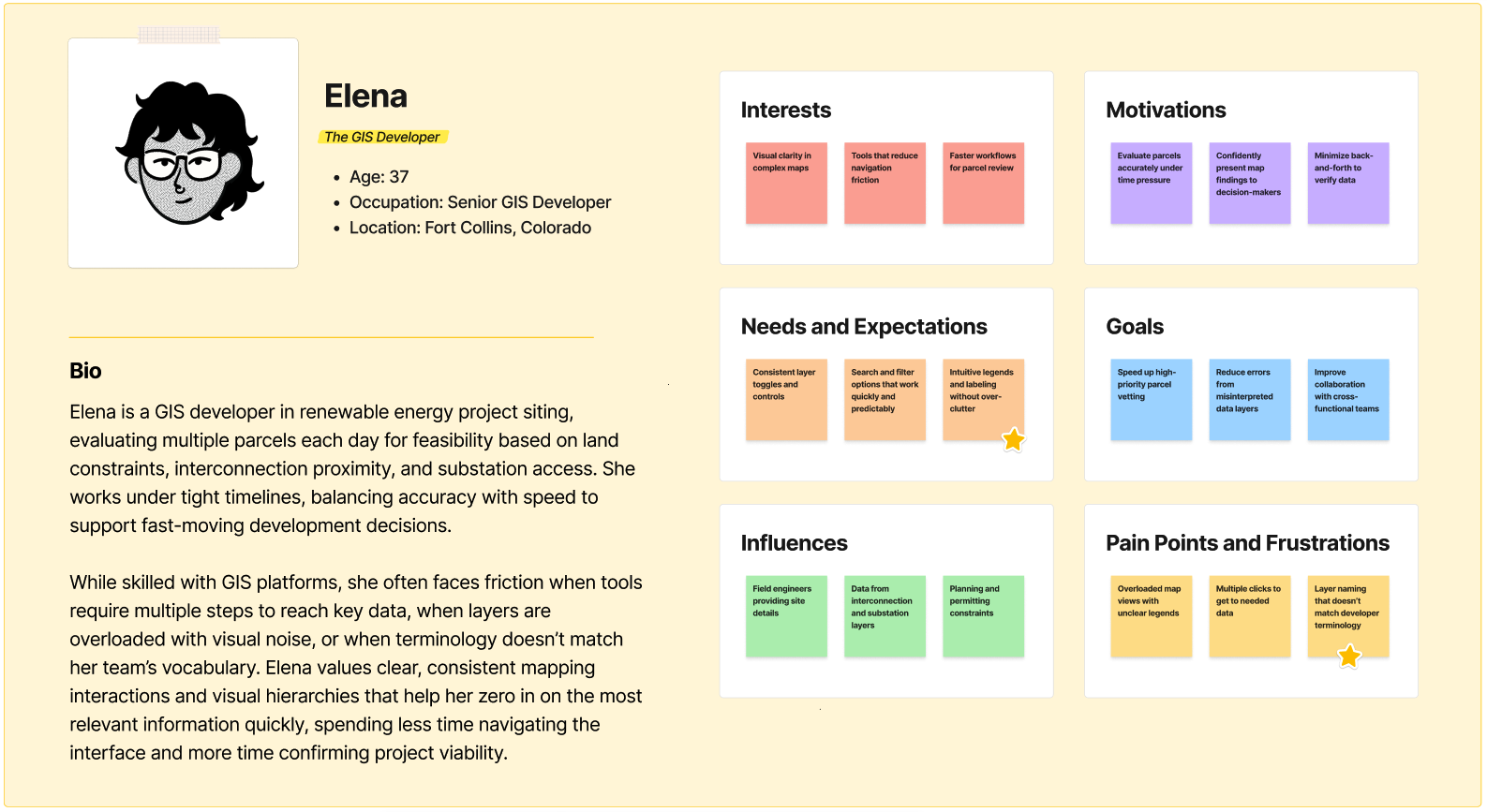
Designing for — Developers Vetting Land at Speed
The Land Fabric GIS tool wasn’t designed for casual exploration—it was a decision-making engine. Our users needed to assess site viability quickly, layering internal and public datasets to determine what parcels could become successful renewable energy projects. What was at stake? Time, investment, and long-term viability.
The tool had to be fast, flexible, and future-proof—able to integrate new data sources and evolving criteria without becoming cluttered or confusing.
Core user personas included:
Project Developers: These users needed immediate answers to foundational questions: Is this land buildable? What’s the interconnection route? Where’s the nearest substation? By surfacing data like environmental constraints and infrastructure overlays upfront, we reduced their dependency on back-and-forth with GIS specialists and empowered quicker go/no-go decisions.
GIS Analysts: While not the primary day-to-day users, this group maintained and refined the tool. Their needs shaped the backend structure, ensuring it could scale with new datasets and evolving business rules—without constant redevelopment or UX degradation.
The result? A tool that turned geospatial complexity into crisp, actionable insight—supporting faster scoping, better collaboration, and smarter land decisions from day one.
The Solution: A UX Framework to Clarify GIS Workflows
To transform the Land Fabric tool into a reliable decision-making resource, I designed a UX strategy that emphasized clarity, consistency, and adaptability across diverse user groups.
Clarified Data Layers & Labels – Introduced clearer visual distinctions, labels, and contextual guidance to reduce ambiguity in interpreting parcel and substation overlays.
Streamlined Navigation – Simplified menus and grouped related actions to help users quickly locate relevant datasets and tools.
Task-Focused Workflows – Reorganized flows around how land developers and engineers actually evaluate parcels, ensuring the tool supported real decision-making steps.
Reusable UX Patterns – Established consistent interaction patterns for toggling, filtering, and comparing maps, reducing cognitive load across teams.
Built for Adoption – Aligned updates with stakeholder needs and provided documentation to support ongoing team use and confidence in the tool.
This solution balanced technical complexity with practical usability. By anchoring the redesign in the daily needs of land developers and interconnection teams, the Land Fabric tool became not only more intuitive but also more strategically valuable as a foundation for EDF’s renewable project siting process.
The Process & What I Did
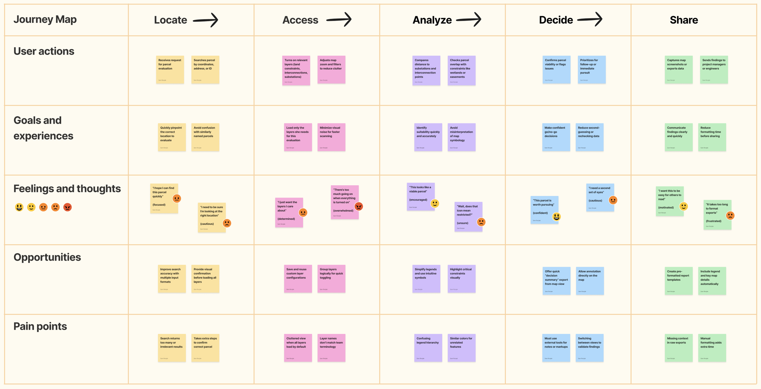
Pinpoint the Pain in Current Maps
Goal: Understand how developers were using GIS maps, and where the interface failed to support decision-making.
I started by observing how project developers vetted parcels using the existing GIS layers. While the map data itself was rich, the interface lacked clear labeling, guidance, and prioritization, leaving users to interpret visual noise without context. Through interviews and usability walk-throughs, I documented where developers hesitated, misinterpreted layers, or struggled to extract actionable insights.
Clarify User Needs & Priorities
Goal: Identify the decision drivers that mattered most for developers evaluating land.
Not every detail on a map was equally relevant. Developers prioritized buildable land, proximity to substations, and grid constraints, while secondary details could be layered in as needed. I created user journey maps and personas to clarify how developers moved from “initial scan” to “detailed vetting.” This work ensured our redesign elevated the most critical layers and metrics, while supporting deeper dives without overwhelming the first glance.
Simplify the Visual Hierarchy
Goal: Reduce clutter and make essential layers and data points easier to scan at speed.
The old interface presented all layers with equal weight, which blurred distinctions between critical and contextual data. I restructured the visual hierarchy: high-priority layers surfaced with clear toggles and consistent icons, while supporting details were available through progressive disclosure. This allowed developers to move quickly without losing access to nuance when needed.
Prototype a Clearer GIS Experience
Goal: Design a leaner, more intuitive interface that guided developers through vetting land systematically.
With priorities clarified, I prototyped new flows for core tasks like selecting parcels, checking capacity, and reviewing constraints. Each prototype emphasized clarity: one task per panel, consistent language across inputs, and contextual help embedded directly into the tool. Early clickable prototypes were tested with developers, validating that the new hierarchy made it easier to reach confident decisions.
Validate with Real Parcels
Goal: Test the redesigned flows against actual project scenarios to ensure accuracy and trust.
We piloted the prototypes with developers using live GIS data from active projects. This surfaced real-world friction, like the need to display parcel boundaries more distinctly and clarify how overlapping constraints impacted eligibility. Iterations incorporated this feedback, ensuring the tool matched not just abstract workflows but the specific challenges developers faced in day-to-day siting.
Prepare for Scalable Adoption
Goal: Build confidence by aligning GIS UX improvements with cross-team processes and training.
Because GIS tooling spanned multiple teams, I collaborated with engineering and leadership to document workflows and provide adoption guides. These materials emphasized how the new design system clarified decision-making and reduced risk. By embedding usability improvements into the broader siting strategy, the project gained both credibility and staying power—ensuring adoption across developers, managers, and technical staff.
The Outcome: Clarity, Confidence, and Strategic Adoption in GIS Tooling
✅ Reduced Support Requests by 50% — Streamlined navigation and clearer language helped users confidently interpret parcel data without needing one-on-one guidance.
✅ Boosted Stakeholder Trust in GIS Data — By mapping UX decisions directly to high-priority use cases, we helped reframe the tool from a “nice to have” to a critical asset for site evaluation and decision-making.
✅ Improved Task Success Across 3 Core Personas — Targeted UX refinements enabled land, interconnection, and project development teams to complete key workflows faster and with fewer errors.
✅ Strategic Input into GIS Roadmap — Research insights uncovered unmet needs across teams, informing roadmap priorities and building alignment between GIS, UX, and development leads.
✅ UX Foundation for Future Layers + Functionality — We established reusable patterns for future enhancements, including environmental overlays and proximity tools—ensuring future iterations can scale without sacrificing usability.
Project Team
This project was a cross-functional collaboration between UX strategy, GIS leadership, and agile development—focused on improving EDF’s internal land mapping tool and strengthening trust in geospatial data across teams.
Our work was deeply informed by the needs of Project Developers, Interconnection, and Land teams—whose feedback shaped everything from interaction patterns to prioritization of key map layers. Together, we built a more intuitive and strategically valuable GIS experience.


Scope & Constraints
Scope:
This project focused on improving EDF’s internal GIS Land Fabric tool—refining map interactions, optimizing data visibility, and helping cross-functional teams interpret parcel data with greater speed and confidence. The redesign also informed roadmap prioritization for future geospatial tooling and set a UX foundation for expanded feature sets.
Constraints:
High Data Complexity: Parcel layers, interconnection paths, and substation boundaries each followed different data models and governance logic—requiring deep research into how different user groups understood and applied spatial data.
No Prior UX Framework: The tool had grown quickly to meet demand, but lacked consistent patterns, naming conventions, or a scalable design strategy.
Diverse Stakeholders with Competing Needs: Land, Interconnection, and Project Development teams had overlapping but divergent goals—necessitating strong persona alignment and thoughtful cross-team synthesis.
Rotating Engineering Team: With engineers cycling on and off the project, continuity and documentation were essential—especially for maintaining design intent and implementation clarity.
Lessons Learned
This project sharpened my ability to deliver UX impact even in constrained environments—where time, tooling, and team availability required deeply strategic collaboration.
Some of my biggest takeaways include:

In future projects, I’ll continue building flexible UX processes that integrate seamlessly into existing team rhythms—making progress possible even when traditional research and design cycles aren’t. The key is meeting people where they are without lowering the bar for clarity or usability.
The Real Win
Designing clarity into geospatial complexity—so users could trust the map and their next move.
Referenced Frameworks & Reading
A few resources that influenced my approach on this project:


