Solar + Storage Platform: UX for Complex Energy Project Financial Dashboards
EDF’s Solar + Storage Costing Platform was built to help project teams model financials for complex hybrid energy developments. The process was mission-critical—but its fragmented spreadsheets and error-prone workflows made high-stakes decisions harder than they needed to be.
I led the UX strategy to transform those workflows: mapping team roles, restructuring key cost inputs, and designing a centralized interface that improved speed, accuracy, and cross-functional collaboration.
This work didn’t just improve a tool—it helped EDF win bids to build new renewable energy projects, like the one featured below.
🎥 Watch the ribbon-cutting ceremony as Arrow Canyon Solar goes online:
Quick Brag: After this solar + storage plant went live, the energy it generated fully powered the first Super Bowl run entirely on renewable energy. ⚡🏈 Catch the CBS Mornings feature covering this milestone.
The Challenge: Disconnected Workflows, High-Stakes Decisions
EDF had committed to doubling its solar + storage capacity to 1.3 GW annually as part of its CAP2030 initiative. But internal teams weren’t scaling at the same rate—and weren’t going to. Without new headcount, our existing workflows needed to stretch dramatically further, faster.
Nowhere was that tension more visible than in costing. The process often took more than three weeks per project, relying on disconnected spreadsheets, institutional knowledge, and individual expertise to deliver high-stakes financial estimates.
We weren’t optimizing for speed alone. We were redesigning the system to deliver reliable insights earlier—without compromising precision. To meet growth targets without sacrificing accuracy, we had to reduce friction across the system and enable consistent, confident financial insight much earlier in development.
Why the Old Workflow Couldn’t Scale
EDF’s solar + storage teams relied on patchworked tools that had never been designed for speed or scale. Each team had its own way of calculating project costs, which led to:
Fragmented Inputs – Disparate data sources made validation difficult and alignment inconsistent.
Manual Entry & Calculations – Repetitive processes slowed delivery and increased risk of error.
No Scenario Comparison – Users lacked a flexible way to weigh trade-offs or present options to leadership.
This wasn’t just a tooling fix—it was a systems redesign to support faster, smarter decision-making at scale.


These examples reflect the fragmented inputs feeding into high‑stakes financial decisions—no wonder users struggled to build accurate bids efficiently.
My Role in This Project
I led UX strategy, research, and design for this internal financial platform—streamlining pricing workflows so EDF teams could build fast, accurate project estimates with greater confidence.
Working closely with finance, engineering, and product leads, I surfaced system-wide bottlenecks, mapped cross-team workflows, and restructured cost input patterns. I designed modular interface components, defined interaction flows, and developed user personas to align key decision-makers around shared financial models.
While I led end-to-end design strategy, this project was a true partnership—made possible by deep collaboration with the engineers and subject matter experts listed below.

Designing for — Accuracy Under Pressure, Across a Fast-Moving Pipeline
The Solar + Storage Costing Tool was built for speed and precision—its purpose was to deliver accurate pricing data for multi-million dollar energy project decisions. Our users weren’t browsing—they were building financial cases that could make or break a bid.
To keep the project grounded, I developed a set of narrative-style user personas that translated complex, cross-functional roles into actionable insight. These personas didn’t just capture user behavior—they clarified priorities, aligned teams, and helped steer product decisions in the right direction as the tool scaled.
Key user profiles included:
The Portfolio Manager: Responsible for compiling complex pricing inputs under intense time pressure, Paola needed a centralized source of truth—one that reduced back-and-forth, supported version control, and gave her the confidence to submit accurate numbers for executive review.
The Technical SME: Responsible for providing granular cost estimates and technical inputs, this user was often brought in midstream—after initial scoping had already begun. They needed fast, intuitive ways to contribute updates, flag risks, and understand how their numbers impacted the overall cost structure. Without clear workflows, they risked becoming the bottleneck—or worse, being blamed for misalignment they didn’t cause.
Because these personas were shared widely across internal teams, I’ve included two versions of the Portfolio Manager persona below. The first follows my standard user-centered format. The second is a polished, shareable version that helped keep multiple teams aligned throughout product development.

Persona in my usual format

Persona in a polished, shareable format
A Note on Screenshots: Because this project involved proprietary financial tools and confidential modeling, you'll notice some screenshots have been blurred. While the data itself is obscured, the UX decisions, design process, and strategic outcomes are fully captured here.
The Solution: Centralized Platform to Simplify Financial Workflows
To optimize the costing workflow, I implemented a user-centered UX strategy that focused on:
Centralizing Data Inputs – Designed a unified interface that consolidated all cost variables in one platform.
Automating Key Calculations – Reduced manual entry by integrating formula-based calculations directly into the tool.
Improving Scenario Comparisons – Introduced interactive data visualization to help teams compare project cost variations more efficiently.
Optimizing for Scalability – Built a modular design framework that allowed the tool to evolve as new pricing models and energy storage configurations emerged.
But this wasn’t just about usability—it was about adaptability.
From day one, we aligned our design strategy with the technical roadmap. Pre-construction and Solar Engineering teams were already building modular “costing engines,” and our interface had to complement that architecture: flexible, transparent, and scalable.
Every design decision—from how templates were selected to how data flowed across stages—was guided by a core principle: Would this reduce the time and effort to create a reliable early-stage pro forma, especially for high-volume solar projects, without adding friction elsewhere?
These changes enhanced usability, reduced errors, and accelerated the cost estimation process—making solar + storage projects more efficient and financially transparent.
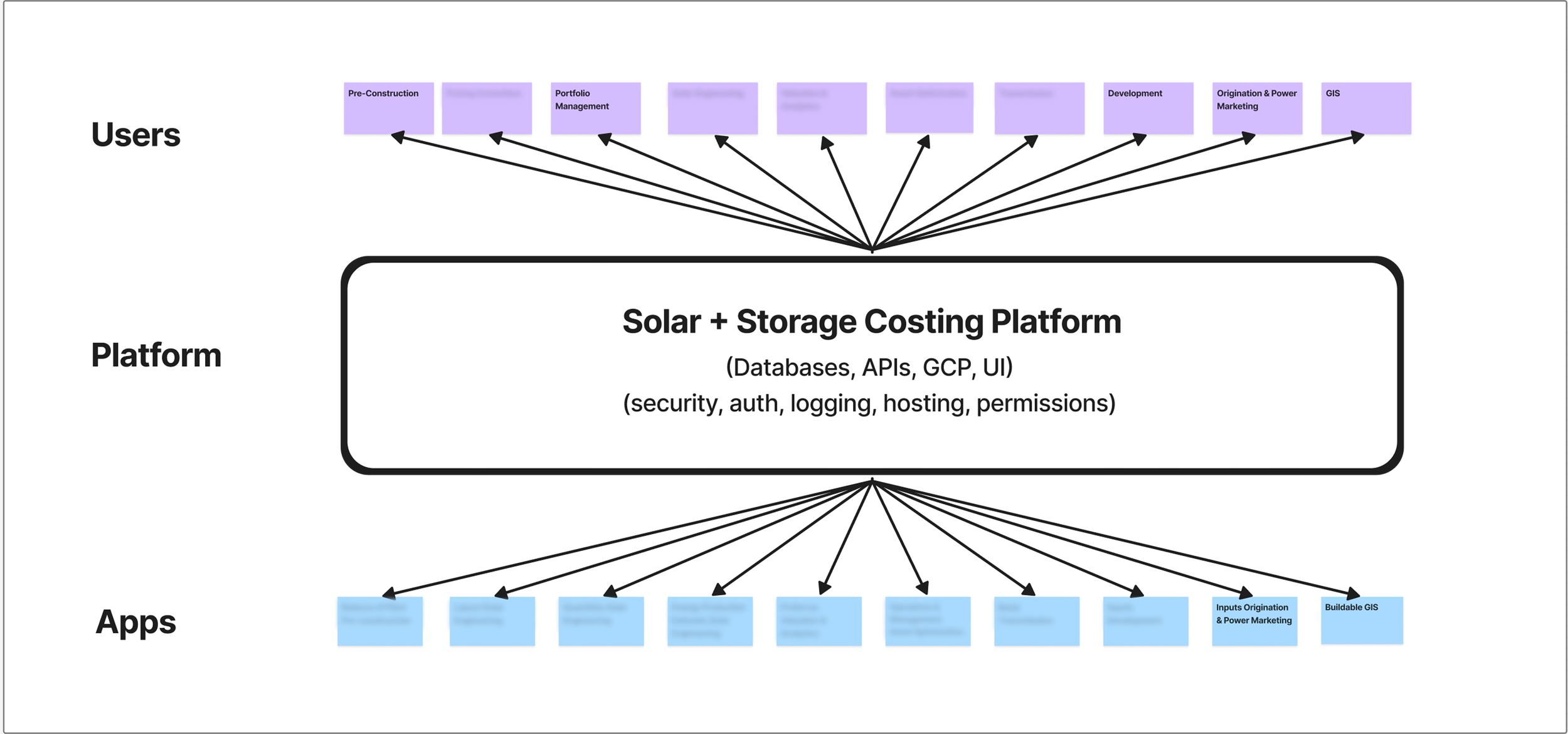
We needed a solution that wouldn’t just work for one app or team—it had to support every user group in this ecosystem.
The Process & What I Did
Understand the Stakes
Goal: Build shared understanding of pain points and downstream impact.
The project began with one pressing question: Where was the friction costing us the most? I led discovery interviews with key stakeholders across Power Marketing, Portfolio Management, and Pre-Construction to map the real-world cost of a broken process.
Everyone described the same core issues: siloed inputs, misaligned assumptions, and a growing burden of spreadsheet workarounds. These weren’t just annoyances—they created tangible financial risk. Delays in proposals, late-stage rework, and confusion over which version of a model to trust were all compounding under tight timelines.
By surfacing these breakdowns early, I helped the team shift focus from isolated interface tweaks to a shared understanding of how disjointed workflows were affecting speed, accuracy, and confidence in financial decisions.
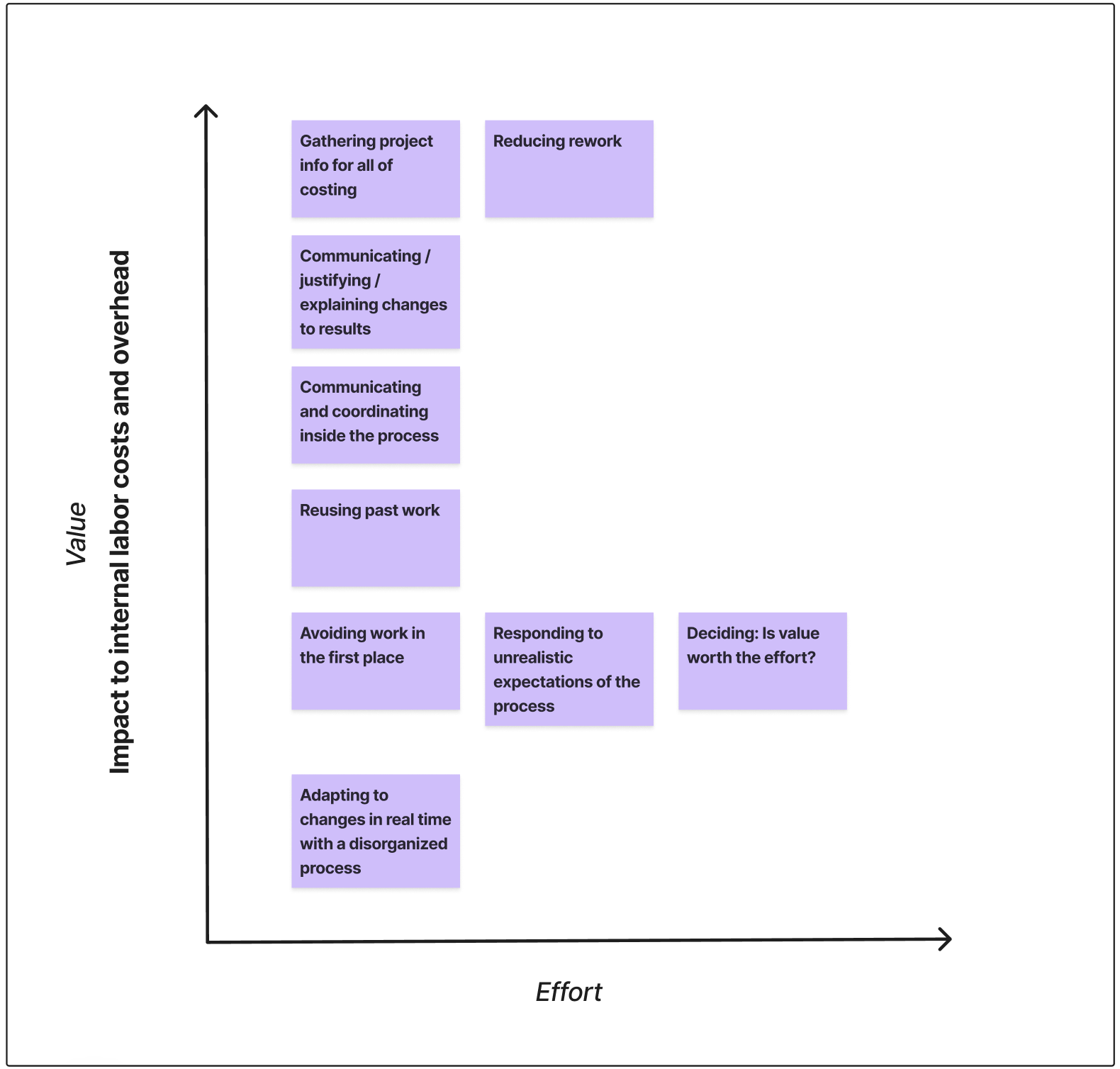
Visual prioritization of pain points and jobs to be done, mapped by impact, effort, and value to guide early design focus.
To visualize the downstream chaos, we mapped how dozens of internal and external contributors touched the same cost data at different stages—each with their own tools, templates, and assumptions.

This diagram helped stakeholders see how small spreadsheet misalignments created ripple effects across entire project phases. (Can you believe this is the “simplified” version?)
I also worked with finance stakeholders to identify the top financial risks introduced by the existing tools:
Outdated escalation assumptions
Hidden formula errors
Inability to run quick scenario comparisons during proposal negotiations
These early conversations helped build urgency and alignment: we weren’t just cleaning up spreadsheets—we were building infrastructure for faster, safer investment decisions.
Clarify Who Needs What
Goal: Identify key roles, timing needs, and the impact of misaligned inputs on project success.
Understanding the tools wasn’t enough—we had to understand the people using them. I developed lightweight personas to capture the priorities, pressures, and behaviors of key decision-makers and supporting roles across the project lifecycle.
Through cross-functional interviews and journey-mapping workshops, we surfaced the “hidden handoffs” where context got lost, assumptions diverged, or key data simply never arrived. Each role had different inputs, but shared the same urgency: get the numbers right, fast.
I created annotated task flows to visualize how each role engaged with the costing process and where breakdowns occurred. These flows helped unify the team around the true complexity of decision-making—and made a clear case for rethinking both tooling and timing.
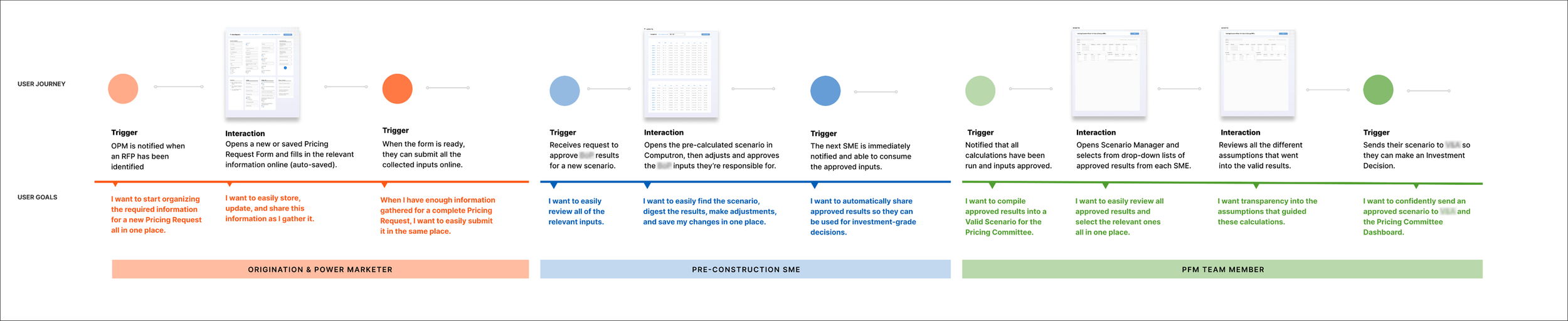
Mapping user journeys helped clarify overlapping responsibilities—and surfaced timing gaps where assumptions were breaking down.
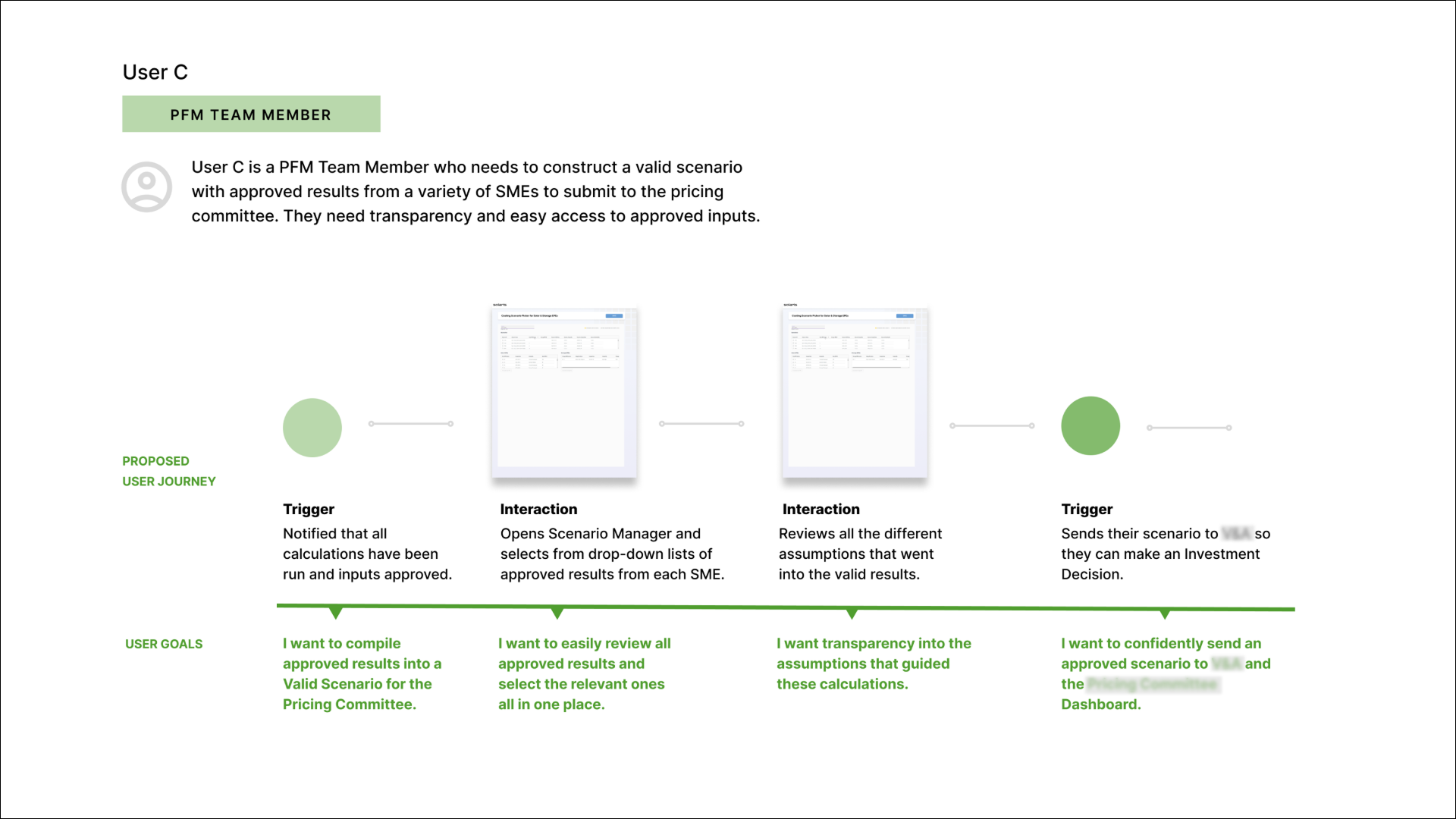
User C’s journey spotlighted the burden of final-stage synthesis—and surfaced opportunities to increase confidence and clarity across tools.
Dig Into the Data Mess
Goal: Break down and categorize how financial data is currently created, transferred, and used
To redesign the costing process, I had to understand its raw material: spreadsheets. I audited active proposal workbooks to trace how estimates were built—from manual inputs to formula logic, version history, and eventual outputs.
By mapping these flows, I identified common failure points: overwritten cells, version mismatches, unclear ownership, and inconsistent assumptions. What looked like a single spreadsheet was often a dozen hidden systems held together by institutional memory.
I categorized these issues into a system of data “handoff zones”—each one representing a potential delay, misalignment, or risk. This analysis became the backbone of our redesign: every UX decision had to protect the integrity of the data.
Our starting point—Scenario Picker—wasn’t built for today’s use cases. We had to rework it to support complexity, usability, and validation.
Design for Change
Goal: Reduce duplication, simplify updates, and enable confident decision-making.
The tool needed to evolve alongside changing project needs—supporting both solar-only and hybrid (solar + storage) configurations without breaking the workflow. I designed a modular input system that scaled cleanly across scenarios, enabling users to toggle between system types while keeping shared elements consistent.
To support versioning and scenario planning, I introduced interface patterns that clearly separated editable inputs from calculated outputs. This let users safely explore options without risking core assumptions. Components were structured to mirror how stakeholders think—grouped by tech stack, project phase, or cost category—rather than how data was originally siloed.


FIX THE HEX CODES FOR RED AND YELLOW! (Check all hex codes)
Early visual definitions helped us establish consistency—and made it easier for developers to implement flexible, maintainable patterns.
Make It Real & Testable
Goal: Build confidence in tool flow and data accuracy under pressure.
Our product owner’s mantra—“If you’re not embarrassed by the first version, you’ve launched too late”—set the tone: move fast, but don’t break trust. Every design decision had to pull its weight immediately—no bloat, no confusion, no second-guessing from users who needed to deliver accurate financials on tight deadlines.
I focused on designing flows that were testable from day one. That meant:
• Tight design-dev alignment on what was MVP-critical vs. nice-to-have
• Click-through prototypes to validate flow logic and data confidence
• Clear UI boundaries between manual inputs, formulas, and outputs to reduce user hesitation
By designing with clarity and testability in mind, we empowered stakeholders to validate logic early and iterate with confidence—without blowing up timelines.
✦ Design Advocacy in Every Story
Even with strong executive buy-in, good UX isn’t always protected by default.
Throughout this project, I collaborated with well-intentioned product leaders who frequently shared visual mockups to help move the project forward. But these mockups—though fast—often introduced visual clutter, broke established patterns, and muddied key interactions. They weren’t just stylistically misaligned—they actively disrupted user understanding.
Instead of rejecting these inputs outright, I built a lightweight system for real-time course correction:
Story by story, I reviewed proposed visuals and offered refined alternatives grounded in UX principles and real user feedback.
Quick-turn Figma updates became a critical tool for aligning high-visibility decisions with our larger design system—without slowing dev velocity.
I paired every change with rationale, helping cross-functional partners understand why clarity mattered—and building shared design standards in the process.
This quiet advocacy paid off: It preserved usability across dozens of iterative updates and helped shape a product that felt cohesive, intuitive, and scalable—without derailing momentum or dismissing partner contributions.
Test with the People Who Count
Goal: Ensure real-world utility by testing with actual users in-context.
We didn’t just test for usability—we tested for usefulness. I ran targeted feedback sessions with stakeholders from Power Marketing, Finance, and Pre-Construction, observing how they interacted with early versions of the tool in real scenarios. Their responses shaped the flow, language, and prioritization of features.
Key insights included:
• The need for persistent visibility into key assumptions (e.g., system size, battery duration)
• Confusion around editable vs. calculated fields—resolved through visual hierarchy and copy
• A preference for “at-a-glance” summaries before diving into detail, which informed the dashboard layout
By testing early and often with the people responsible for actual cost decisions, we built a tool that didn’t just look good—it held up under real-world pressure.
Set It Up to Last
Goal: Set the stage for long-term adoption and evolution.
From the start, I knew the real success metric wasn’t just launch—it was longevity. I documented the full design rationale, mapped out a flexible cost input schema, and created artifacts to support engineering through future iterations.
Deliverables included:
• Annotated Figma files explaining logic behind each interaction and grouping
• A modular design system built for reuse across other internal tools
• Clear schema documentation to support evolving cost categories and tech configurations
By pairing thoughtful documentation with scalable component logic, we ensured this wasn’t just a one-off tool—it was a foundation EDF could build on.
The Outcome: An Interface that Boosts Accuracy, Trust, and Speed
This wasn’t just a tool upgrade—it was a strategic shift in how early-stage financials were generated, aligned, and trusted across teams.
✅ 30% Faster Cost Estimates — The streamlined interface cut average modeling time from three weeks to five days—freeing teams to focus on project strategy, not just data wrangling.
✅ Fewer Errors, Higher Confidence — By reducing manual entry points and clarifying inputs, the platform improved accuracy in early financial modeling—minimizing risk downstream.
✅ Clearer Alignment Across Stakeholders — Consistent logic and intuitive flows made it easier for teams across finance, development, and construction to align on feasibility and pricing decisions.
✅ Scalable Framework for Future Models — The modular structure allowed teams to iterate on pricing assumptions and adapt the tool for new use cases—without starting from scratch.
“I had a pricing kick-off for a project proposal yesterday. Scenario created with inputs from multiple teams done by end of day (!!) and sent off the storage sizing request SO SEAMLESSLY. Thank you — really good stuff and things are moving so smoothly, especially as cross-functional teams are all continuing to norm to the new processes and tools.
”Usually this step would take me 3–5 days to wrangle the correct information and data from the prospecting teams. Really cool to see and feel real-time improvements. ”

What once took 3+ weeks now takes 5 days—with clearer handoffs, less rework, and centralized data flows.
Project Team
This project brought together UX strategy, agile development, and product ownership to redesign EDF’s solar + storage costing platform—streamlining proposals and accelerating internal workflows.
This redesign was also informed by extensive collaboration with the internal Portfolio Management (PFM) team, our primary end users, whose feedback directly shaped interface improvements and workflow adjustments.


Scope & Constraints
Scope:
This project focused on improving EDF’s internal Solar + Storage Costing Tool, which supports high-stakes financial modeling for hybrid energy projects. The goal was to reduce friction across inputs from multiple teams, streamline workflows, and introduce UX structures that could scale with the platform’s evolving complexity.
We worked closely with product owners to validate assumptions, clarify user flows, and prioritize foundational improvements—while still supporting immediate delivery needs.
Constraints:
Cross-Team Complexity: The platform served multiple stakeholders with different inputs, expectations, and timelines—making collaboration and alignment a continual challenge.
Limited User Availability: Key users were managing critical deadlines and had limited time for discovery sessions, so research had to be sharply focused and outcome-driven.
Backend & Data Architecture Challenges: Engineering complexity and shifting infrastructure made implementation timelines fluid, requiring adaptable design that could flex around technical realities.
Ongoing Implementation: While the UX work delivered a centralized interface framework and clearer paths to collaboration, the full feature set continued to evolve—so success depended on flexible design thinking and strong cross-functional communication.
Lessons Learned
This project reinforced the importance of UX in financial modeling tools and the impact of simplifying workflows for energy projects.
Key insights include:

Going forward, I’d explore how UX can actively support decision intelligence—embedding interface patterns that surface insight, reduce friction, and build stakeholder confidence in real-time financial scenarios.
The Real Win
Turning fragmented spreadsheets into one streamlined platform—reducing human error and accelerating decisions.
Referenced Frameworks & Reading
A few resources that influenced my approach on this project: