Jones Sign: UX Overhaul for a National B2B Signage Leader
I led UX strategy and information architecture for Jones Sign, a leading architectural signage company that needed a digital presence reflecting its expertise and nationwide portfolio. Through strategic UX research, site architecture refinement, and high-impact content structuring, we redesigned a 40+ page marketing website that elevated brand credibility, improved navigation, and enhanced lead generation.
Project Overview
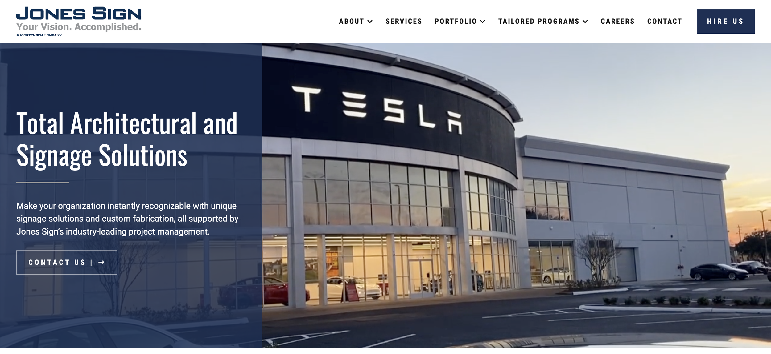
Jones Sign, a national leader in architectural signage, needed a modernized digital presence to better communicate its expertise and drive lead generation. As part of the HeiPro Digital team, I led UX strategy and information architecture, restructuring a 40+ page marketing website to highlight Jones Sign’s extensive portfolio, streamline navigation, and reinforce its industry leadership. The result was a high-impact B2B platform that enhanced credibility and significantly improved user engagement.

The Challenge: A Website That Didn’t Reflect Industry Leadership
Jones Sign, a leader in architectural signage, had a strong reputation but an outdated digital presence that failed to convey its expertise. Key pain points included:
Disorganized Navigation – Customers struggled to find relevant services and past projects.
Weak Lead Generation – The site lacked clear conversion pathways, limiting new business inquiries.
Underutilized Portfolio Content – Case studies and project visuals were not effectively structured.
To reinforce Jones Sign’s market authority and attract new clients, the website needed a strategic UX redesign that improved content discoverability and lead generation.
The Solution: A Content-Driven UX Overhaul for Better Lead Generation
To modernize Jones Sign’s digital presence, I developed a UX strategy focused on information clarity, user engagement, and conversion optimization.
🗺️ Restructured Site Navigation – Simplified content hierarchy to make it easier for potential clients to find relevant services and case studies.
🖼️ Portfolio Optimization – Transformed the project gallery into an interactive showcase of Jones Sign’s expertise.
📩 Lead Generation Enhancements – Implemented strategically placed CTAs and inquiry forms to improve conversion rates.
🎨 UX & UI Refinements – Elevated the site’s visual design to align with Jones Sign’s brand authority and credibility.
These improvements positioned Jones Sign as a trusted industry leader, making it easier for potential clients to explore their capabilities and connect with their team.
The Outcome: A Lead-Generating Website That Reflects Industry Experience
The Jones Sign website redesign reinforced market authority, improved navigation, and strengthened lead generation.
🗂️ Clearer Service & Portfolio Navigation – Users could easily find relevant case studies and service offerings.
📈 Higher Engagement with Portfolio Content – The optimized case study layout highlighted Jones Sign’s expertise.
🏆 Improved Credibility & Brand Positioning – A modernized UX aligned with Jones Sign’s leadership in signage solutions.
📩 Stronger Lead Generation Pathways – Inquiry forms and CTAs were strategically placed to drive conversions.
My Role & Involvement
August 2020 - June 2021
This was one of the first projects where I was assigned to a UX-specific role within this agency instead of working on the full site process. With the details of web design and development assigned to others on the team, I was assigned to optimize the site organization and strategy (the information architecture). This decision absolutely made sense for such a large site and this project served as the catalyst for me to really evaluate how I communicated my UX designs when handing off the details of the layout and build to the rest of the team.
Background
I was hired on as HeiPro Digital’s first contracted designer and spent my first year with the company working closely with the two company founders, Alex and Elizabeth. When their company was still in the startup phase, I worked in a variety of settings—everything from social media marketing to UX research—and found my niche in UX and Responsive Web Design by the time there was a large enough team in place to take on this large project.
I have been fortunate to work so closely with the supportive team at HeiPro Digital and have grown tremendously during my time with them, some key achievements of which I will list below:
Grew in flexibility with changing team dynamics. In the span of a year, the HeiPro team grew from three designers to over 10 in total, so my responsibilities shifted dramatically as the team scaled. Not only did this give me the opportunity to learn in a hands-on way in multiple disciplines, but I got to exercise my collaborative skills as the team dynamics shifted with each new project.
Researched extensively before, during, and after bringing a product to market. Especially with this project, I gained experience in User Research as I led the early Discovery Process, talking directly with company stakeholders and recent clients who provided insight that guided our UX goals for this project. With each new iteration, we reevaluated the effectiveness of our layout with real users to ensure we met their needs and provided a seamless user experience.
Understanding the Challenge
We had to strike a balance between using industry-specific terms and making the site easy for all visitors to understand and navigate. We had a lot of conversations with stakeholders and former clients to figure out how to organize each of the 40 pages of the site in a way that met the stakeholders’ goals without confusing site visitors.
Highlight their vast portfolio in an easy-to-navigate way, while accomodating for less than website-worthy photos of most installations.
Information Architecture
I worked most directly with the team’s copywriter and SEO specialist to organize all of the site’s content in a way that highlights their expertise in an easily-searchable, intuitive way for visitors. After weeks of iterations, we brought all 40 of the page layouts (with sketches, site maps, and low-fi prototypes) to the dev team, then worked through each of the pages a few more times before they were approved for build-out.
Client Feedback
“The team at HeiPro Digital has been fantastic to work with. We were looking to upgrade our website to align with our company goals and growth, and that is when we found HeiPro Digital. They have been nothing but incredible to work with. They dove right in to learn our business and understand our company goals in order to truly promote who Jones Sign is through our website. Since our website launched, we have received nothing but compliments from employees and customers. We are elated with our new website and will definitely have more projects for them in the future!” — Katie Kufalk, Jones Sign Co.
Agency Feedback
“The Jones Sign website was a massive project that involved nearly every member of our team. This was an exercise in cooperation and communication, both internally and with the Jones team. We are thrilled with the outcome, which is made even more rewarding because it demonstrates just how well our team can work together even on the most challenging of projects!” - Alex and Elizabeth, HeiPro Owners
Results and Takeaways
With the success of this site, Jones Sign’s parent company contracted the HeiPro Digital team to create new websites for the four other companies they manage. With all five sites now launched, the company stakeholders finally feel confident that their web presence reflects their company goals and growth.
My biggest takeaways from this project include:
Clearly communicate the purpose of every choice. Even if it seems clear to me, talking through my process and what led to the layout and interactive decisions will benefit everyone on the team as they work on their respective elements.
Listen to the feedback of your teammates. And ask follow-up questions! On the flip side, it can be easy to think I understand the motivations and intents of my teammates, but asking a few clarifying questions can go a long way to creating a cohesive product.
Project Team
This project was a collaborative effort across UX, content strategy, and digital design, ensuring a structured and engaging online presence for a national signage leader. Here’s the team that brought it to life.


Lessons Learned
This project highlighted the challenges of designing for a B2B audience in a highly specialized industry. My key insights include:
Content strategy is critical for industry positioning – Clearly structuring services and past work helped reinforce Jones Sign’s expertise and credibility.
SEO and UX go hand in hand – Optimizing navigation and site structure for both users and search engines improved discoverability.
Showcasing a portfolio effectively requires storytelling – Positioning Jones Sign’s work as case studies, rather than just image galleries, added depth and engagement.
For future projects, I’d further refine stakeholder-driven content strategies, ensuring that complex B2B offerings are not only visually compelling but also structured to align with evolving business goals and industry trends.